Text by Elizabeth Czapski
After several months in their midcentury cottage in the historic and highly sought-after Augusta Road area of Greenville, South Carolina, the homeowners stumbled upon a project by Cynthia Masters of Panageries—one she calls “a study in blues.” They knew she was the perfect fit to help update their home for modern-day family life with two young boys while also infusing it with vibrant vintage style balanced by contemporary touches and the grounding classic elements the couple is partial to.

“[The homeowners] love traditional design, Asian-inspired pieces, and all shades of blue,” Cynthia says of the trifecta that focused their approach. “I wanted to give them the traditional interior they wanted but also something that reflected a couple in their 30s. Our goal was to design elegantly timeless interiors that would function perfectly for this young, active family.”

The Panageries team started by using the family’s treasured vintage fixtures as jumping-off points for each space. “They had so many vintage pieces,” Cynthia says. “It was just about finding spots for these cherished pieces and then building from that.”

In the formal living room, their muse was a vintage sofa and an antique wooden chest that had been in the family for years. “We had the sofa finish updated to a gold metallic and covered it in a charcoal velvet and then began to layer in the other elements to create the design,” Cynthia says of the dynamic mix of color, pattern, and materials they incorporated—including an antique mirrored accent wall that enlarges the space and amplifies their bright, bold selections.

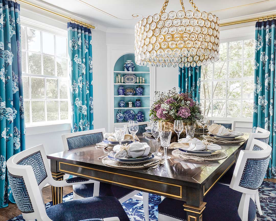
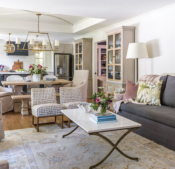
In the dining room, they prioritized a place for the owners’ circa-1850s china cabinet, which they painted royal blue, and the family room’s guiding feature was a vintage cocktail table. They concentrated the couple’s inherited collection of blue-and-white porcelain to these spaces—displaying them with prominence in the china cabinet and built-ins beside other favorite items like Far Eastern accessories. “I really believe in keeping your collections together,” Cynthia says. “They make more of an impact and a better statement.”

Amid all the time-honored inclusions, abstract art and contemporary works invigorate the interiors throughout. “We were careful with the artwork to keep that updated to balance these more heirloom-type pieces and keep things from getting stodgy,” Cynthia says. This art, along with fabrics and accents, instills distinctive color that also freshens the design with a rich palette of jewel tones as well as gleaming touches that steer the look toward Old Hollywood glam.

“I think the color palette is what makes the home [unique]. It’s an unusual palette—almost regal,” Cynthia says of the play of aqua, turquoise, navy, lavender, and amethyst. While they went into the project knowing blues would permeate the spaces, the purples were a surprise—and “a tough sell in the beginning,” Cynthia says. “But I was worried it was going to get too cool with the gray walls and all the blues. I just felt like it wouldn’t have enough warmth and balance.”

An eclectic blend of prints—from classics like chinoiserie to modern geometrics and ever-popular florals—breaks up the saturated color scheme, while a whisper gray and crisp white foundation, paired with reflective inclusions and textural interest, offers a visual rest from all the color and pattern.

“We were so careful as we were making our selections to keep them very edited and curated,” Cynthia says. “Since we used the light walls and white trim and cabinets, we were able to bring in some of these patterns, and it’s not cacophonous at all. And we added a lot of reflective surfaces—antique mirror, mercury glass, and crystal. That helped reflect light to keep it from getting heavy.”

But beyond this showstopping ambience is a home that performs impeccably for this growing family, thanks to several space-saving features. “Because the house was built in 1954, it had limited storage,” Cynthia says. “We tried to come up with ways to display the things they had but also to give them additional storage.” This translated to a long wall of floor-to-ceiling cabinets leading from the kitchen to the back door, a built-in banquette at the breakfast table with drawers underneath, and a wine bar right off the kitchen in the family room.

“Getting it to a place where it could really function for them as the boys grew up and giving them spots for adult entertaining but also for the boys to play—function was what it was all about,” Cynthia says. The kids’ domain—their bedrooms and a playroom—is upstairs, which helps keep clutter to a minimum on the main level.

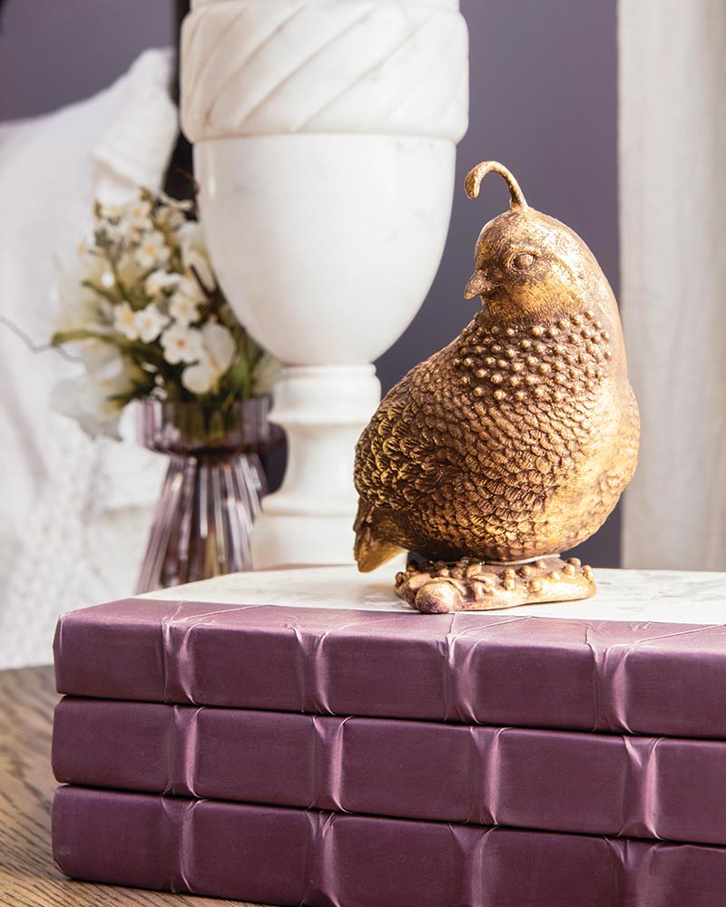
The bedrooms downstairs continue the home’s signature hues, as well as beloved motifs like Asian and avian and, of course, a vintage aesthetic. Cool, soothing blue in the primary bedroom gains intrigue from toile window treatments and a Far Eastern-inspired office nook, while the guest room is a fun foray in purple with bird-themed art and accents.

“It’s a complete reflection of [the homeowners] and their likes,” Cynthia says of the overall design. “We were able to pull it all together and weave the Asian thread and color palette throughout. I was able to give them the shimmer and texture to make [the traditional] interesting. It embraces lively energy while maintaining sophistication and ease of living.”


