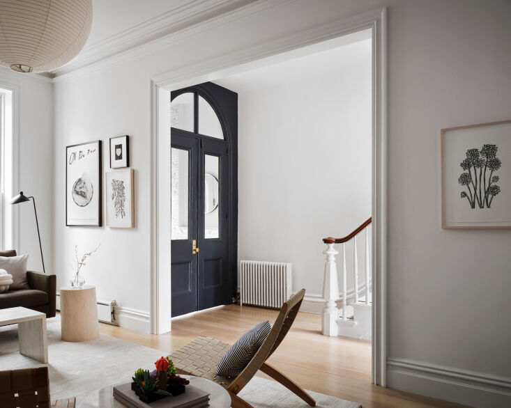
The bane of homebuyers (at least those who also happen to be Remodelista readers) is a beautiful old house that has been updated but in a hodge-podge, piecemeal, and highly unappealing manner. This is a common occurrence in Brooklyn, where beautiful original architectural details are often stripped out or overwhelmed by the “upgrades.” Undaunted design-minded buyers then have to commit to pricey do-overs that modernize the home while honoring its past.
How to avoid a renovation that you’ll regret and future buyers will shun? Today, we showcase tips from Shana Faust, a freelance creative director who oversaw the remodel of the 19th-century Gowanus townhome she shares with her husband, Steven, an executive creative director at Ogilvy; their two kids (Sophie and Leo); and one miniature poodle (Tiger). “When we first saw this house, it was in utter disrepair. Derelict and dark, filled with tight spaces, damaged floors, and original single-paned windows,” recalls Shana. “It was exactly what we were looking for.”
That’s because she had a clear vision for the renovation: “to preserve and celebrate the rich historical elements that remained and merge those with contemporary elements, minimalist design interventions, and lots of natural light.” With the help of architects Alexandra Barker and Chrisina Ostermeier, of BAAO, they did just that.
Below, Shana’s tips on how to transform an outdated property into a minimalist home—all without erasing historical details and without breaking the bank.
Photography by David Mitchell, courtesy of Shana Faust.
1. Always start with a palette—for both colors and materials.

What’s the secret to a renovation that feels cohesive? The answer boils down to one word: planning. And one of the first things to decide (after figuring out the budget) is the materials palette. A materials palette is like a color palette but instead of colors, it involves the set of materials you plan to use throughout the home. Together, they create the home’s visual language. For her materials palette, Shana drew inspiration from the Gowanus’ maritime roots. “The marine-inspired palette of azure, gray, and moody charcoal, as well as materials like socket sconces, brass, sisal, shiplap, marble, and pocket doors, are all references to its seafaring past,” she says.


