OK, OK, we’re weighing in on Unexpected Red Theory.
You may have seen the idea crop up in your Instagram feed (or on TikTok, if you’re really up to date). It started with TikToker/designer Taylor Simon, who suggested that adding a dose of red—”big or small, in a room where it doesn’t match”—makes the whole scheme more interesting. (Watch the original video here, if you care to.) Then Farrow & Ball weighed in (and shared a glimpse of The House on Dolphin Street), and we started noticing the principle in some of our favorite projects.
Much like the Wrong Shoe Theory (the idea that choosing a surprising, slightly off-looking shoe can make an outfit), the effect is probably more due to adding something unexpected rather than the color itself. Still, these examples make a strong case for adding a bit of red….
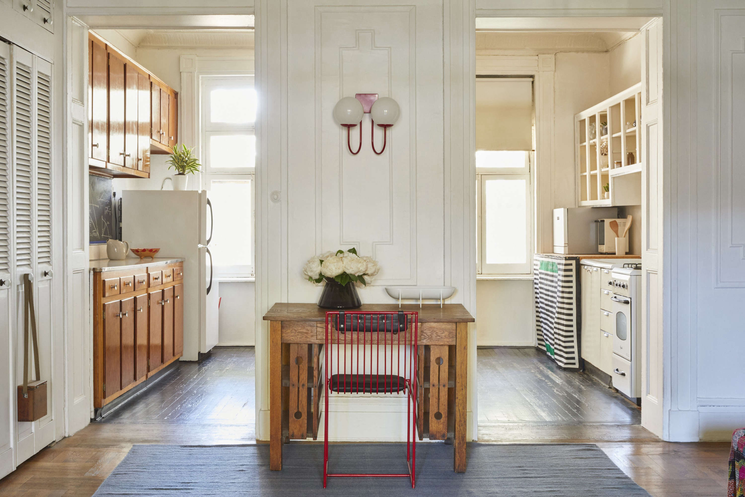
 Above: Red chair, red wall sconce, in At Home with C. S. Valentin: French Eclecticism in Cobble Hill, Brooklyn. Styling by Alexa Hotz and photograph by Jonathan Hokklo for Remodelista.
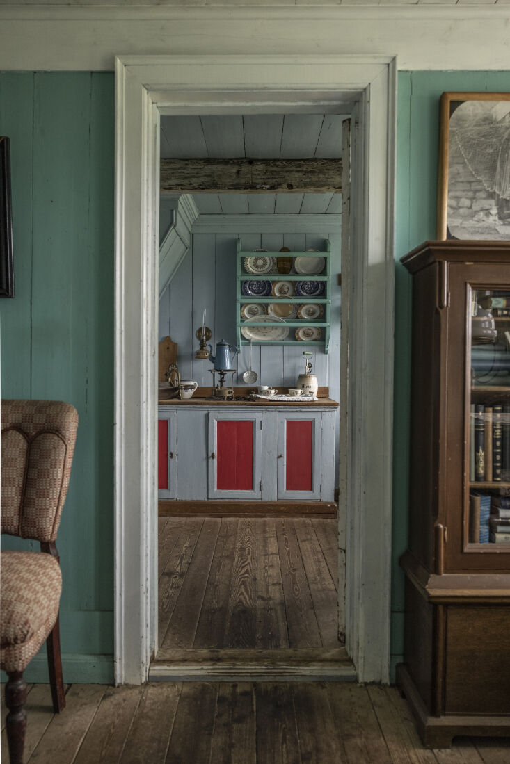 Above: No need to go all in on a red kitchen—just a little paint will do. Photograph by Greta Rybus from 16 Ideas to Steal from Iceland (and Icelandic Turf Houses).
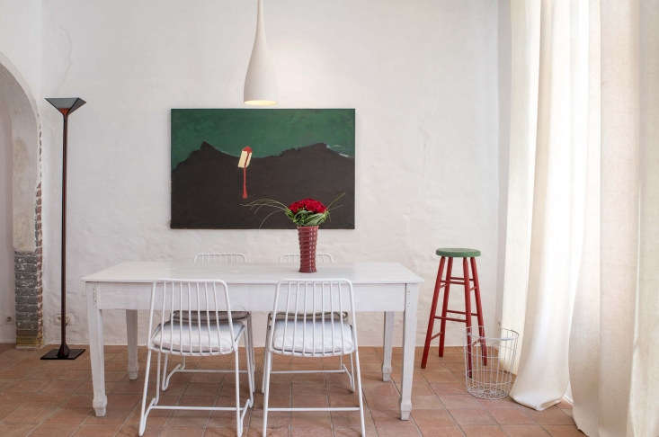 Above: Red paired with green in Angle of Repose: A Restored House in Tielrode, Belgium, Available for Rent. Photograph courtesy of Danica O. Kus.
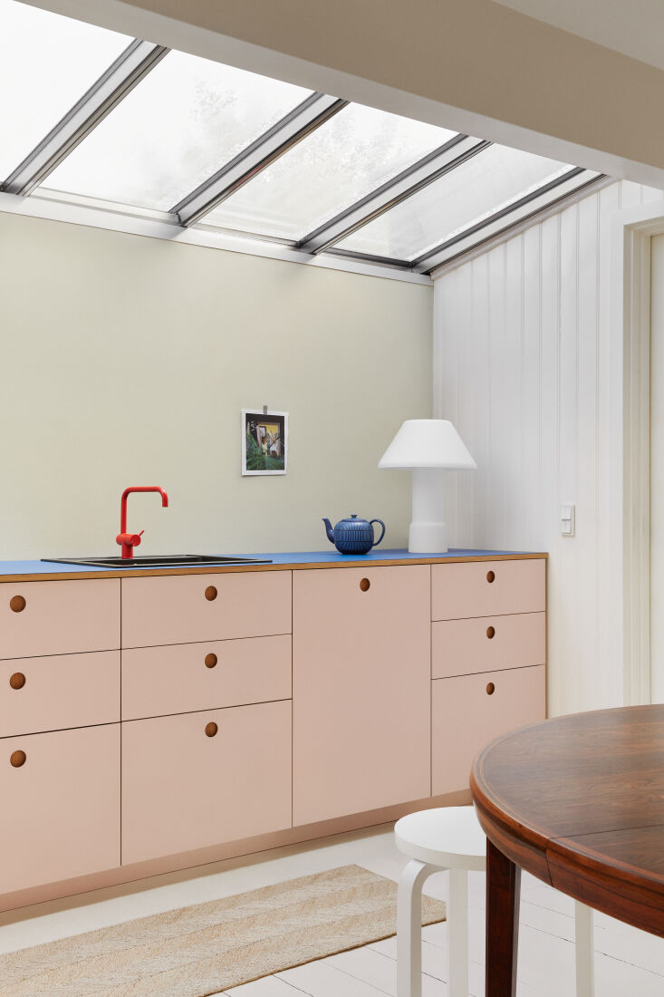 Above: For your consideration: a red faucet. Photograph from Kitchen of the Week: Pale Pink Minimalism on the Coast of Denmark.
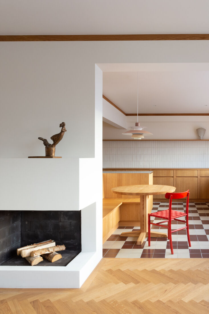 Above: A single red chair in A Modern Classic Apartment Interior in Helsinki, Finland. Photograph by Mary Gaudin courtesy of Katie Lockhart Studio.
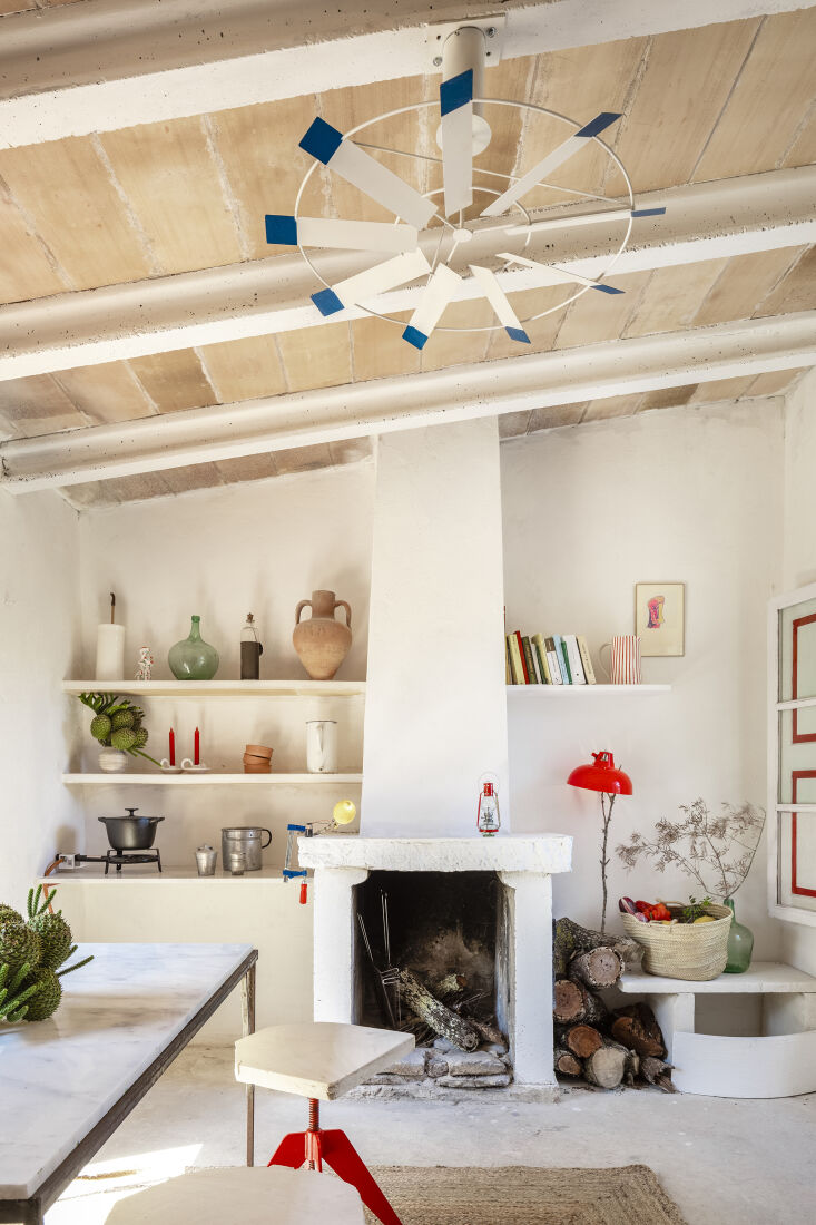 Above: Splashes of tomato red in Shed Chic: Architect Mariana de Delás Turns an Off-the-Grid Hut into a Dream Retreat. Photograph by Tomeu Canvellas, courtesy of Mariana de Delás.
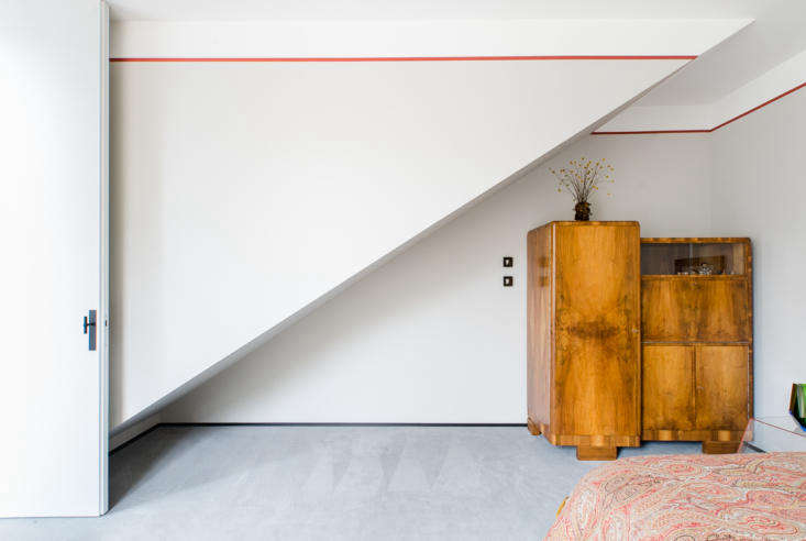 Above: Painted red “piping” in a project by Marta Chrapka of Colombe Design; see Modern Love: A Contemporary House Updated with Antiques… Photograph by Pion Studio, courtesy of Colombe Design.
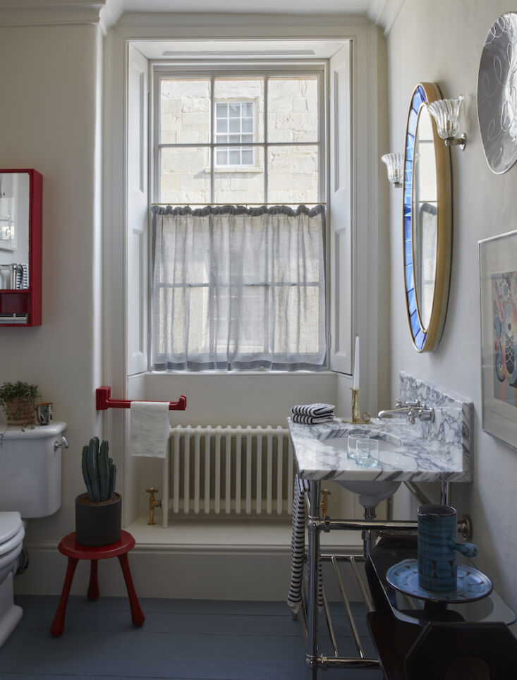 Above: A rather unexpected red towel rack, mirror, and stool in the bath, as seen in Found and Fine: A Curated Stay At 8 Holland Street Townhouse, Bath…
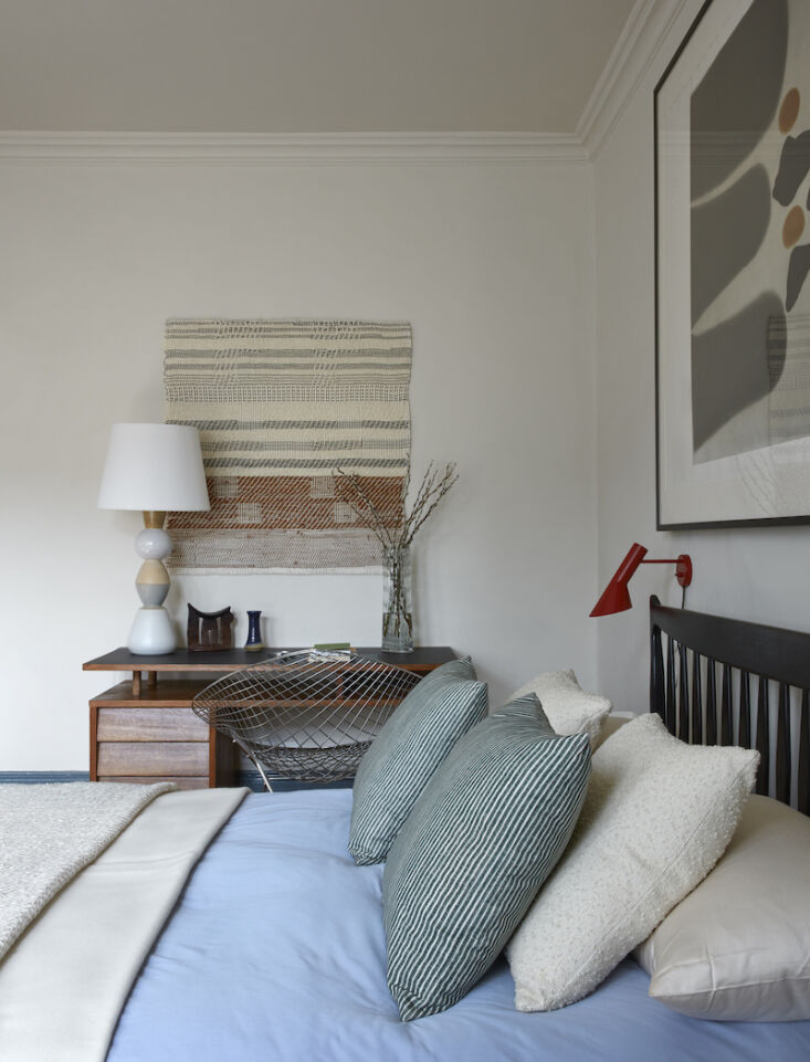 Above: …and a jaunty red reading light, too (also from Found and Fine: A Curated Stay At 8 Holland Street Townhouse, Bath).
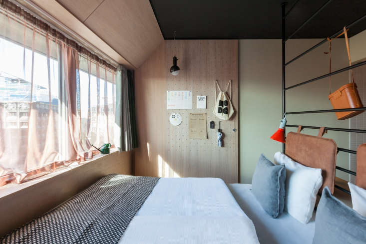 Above: And a red clip-on light: see Small-Space Solutions: 5 Tiny Bedroom (and Dorm) Ideas to Steal from Stockholm’s Hobo Hotel. Photograph courtesy of Studio Aisslinger and the Hobo Hotel.
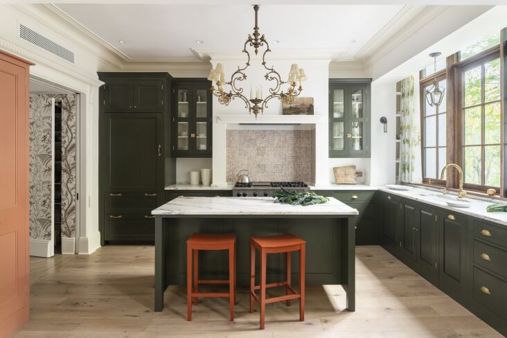 Above: Twin counter stools (painted in a “utilitarian red” called Rusty Nail) in an otherwise green kitchen; see Kitchen of the Week: A Plain English Kitchen in a Brooklyn Brownstone, Space-Gaining Bay Window Included. Photograph by Kyle Norton, courtesy of Plain English and Anat Soudry Architect.
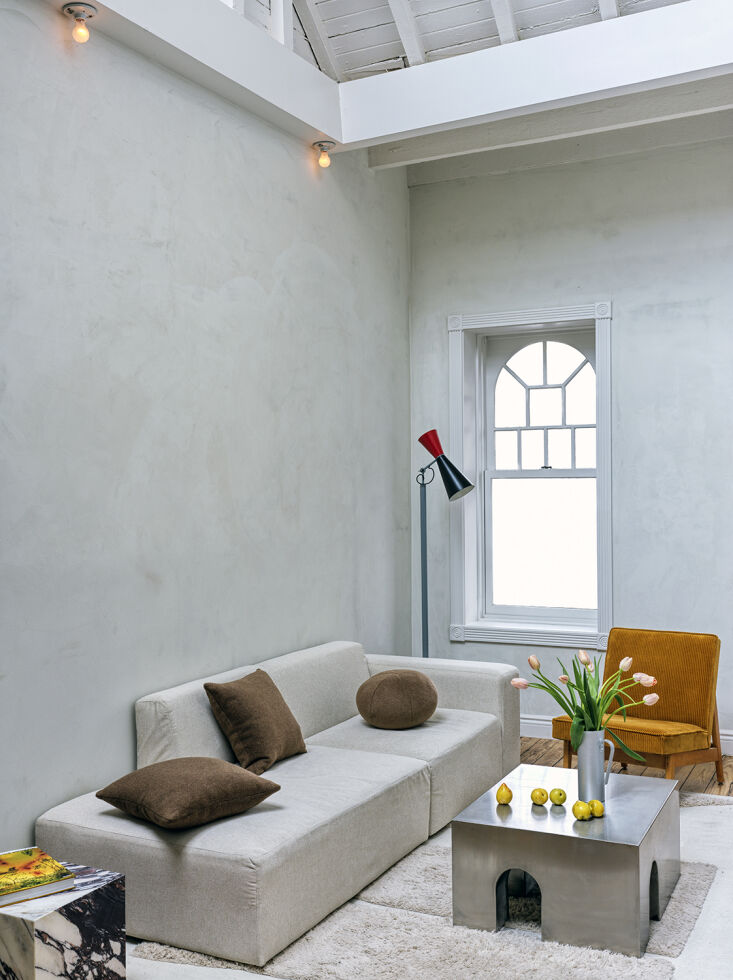 Above: A Le Corbusier Parliament Lamp is the only hint of red in this “not too precious” living room; photograph by Chris Mottalini, courtesy of BoND, from A Revived NYC Garret with a Space-Saving Bed in a Box, Before and After.
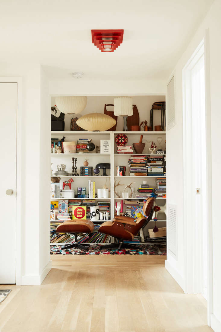 Above: A very unexpected red light fixture in A Reimagined Ranch House: An Artist’s Family Home, Ikea Kitchen and DIY Bath Ideas Included. Photograph by Michael Fine.
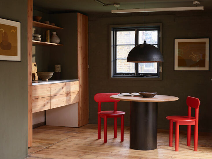 Above: A pair of red chairs almost clash with the dark surrounds in Fred Rigby Studio: A New Creative Space for Free Thinking in London. Photograph by Jake Curtis.
 Above: A low-commitment option: red art, as seen in The Right Formula: A Restrained Renovation by A British Jeweler.
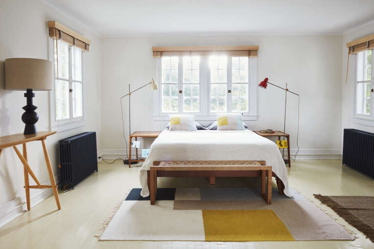 Above: Another spotting in a C.S. Valentin project: red beside the bed. Styling by Alexa Hotz and photograph by Jonathan Hökklo for Remodelista from A Colonial House in Bellport with Uncommon Style from French Designer C. S. Valentin.
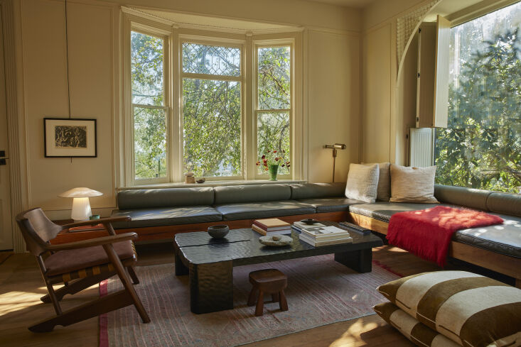 Above: A mohair throw adds a twist to the living area in Architect Pat Bernatz’s Reimagined House on the Hill in East LA. Photograph by Yoshihiro Makino, courtesy of Bernatz Studio.
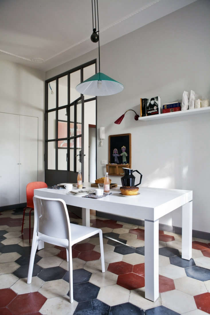 Above: Red tiles in An Artful Twentieth-Century House in Italy in an Of-the-Moment Palette…. Photograph by Serena Eller, courtesy of Mondadori and Studio Strato.
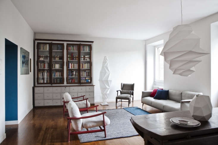 Above: …and a pair of armchairs, too. An Artful Twentieth-Century House in Italy in an Of-the-Moment Palette…. Photograph by Serena Eller, courtesy of Mondadori and Studio Strato.
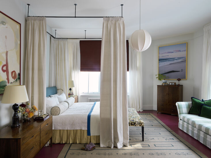 Above: A red floor peeks out around the edges of the rug in this bedroom by Beata Heuman: see A Masterful Mix-and-Match Apartment in London by Beata Heuman. Photograph by Simon Brown.
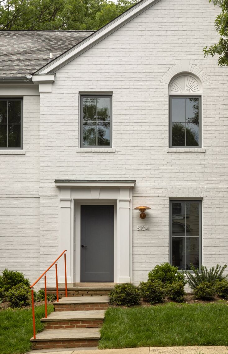 Above: Finally, the Unexpected Red Theory heads outside. Photograph by Jenn Verrier, courtesy of Fowlkes Studio, from this week’s Modern Design Meets the Center-Hall Colonial: A Washington D.C. House Gets a Bright New Guise.
What do you make of the Unexpected Red Theory? Let us know in the comments.
P.S. More trends:
