Text by Holly Seng
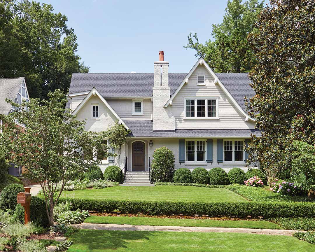
Nestled in the picturesque Morningside neighborhood of Atlanta, Georgia, Tara and Randy Parrish’s 1940s cottage underwent a dramatic transformation—both inside and out. A coat of cream paint brightens the home’s exterior and accentuates the chimney. However, it’s the extensive renovations, which make use of swooping rooflines to expand the second floor, that ensure this home exudes striking charm.

“Respecting the original architecture and scale of the home was important,” says architect Tim Adams, noting the home’s exterior design. Keeping in mind the neighborhood’s small cottage aesthetic—as well as the size of the lot—Tim was able to house the three upstairs bedrooms the homeowners desired within the roofline so the home would take on a story-and-a-half appearance.

Changes to the back exterior of the home largely focused on connecting the interiors to the outdoors. Expansive windows incorporate an abundance of natural light while a screened porch serves as a favorite gathering spot for the Parrishes and their two daughters.

Offering the best of both worlds, the porch pairs verdant views with comfortable furnishings—including teak pieces outfitted with light blue cushions and pillows featuring playful patterns in deeper blue shades. The vaulted ceiling enlarges the outdoor room as it contributes to the light and airy atmosphere.

Textures take prominence throughout the home with pattern providing interest and depth to the primarily neutral palette. “The homeowner is all about layering, textures, and keeping everything clean and fresh,” says interior designer Courtney Dickey.

In the family room, a soft Oushak rug is layered atop a larger sisal rug, bringing in notes of coral echoed in the throw pillows on the linen sofa. A square leather-upholstered ottoman serves as a coffee table, its rich tan hue warming up the living area. There’s no shortage of natural light thanks to the bay window, complete with a spacious window seat ideal for cozying up with a book.

Another massive renovation involved swapping the location of the kitchen and stairs. “That was a big move, and quite frankly, it was not easy,” says Tim. However, the team’s efforts paid off, as it allowed for an open floor plan with the kitchen in the middle of the home, and for windows to be placed in the stairwell. “Having those windows up high in the stairwell drops a ton of light in the kitchen throughout the day,” he says.

From the cabinets and subway tile backsplash to the painted wood ceiling, the crisp white palette serves as a fitting backdrop to reflect the profusion of natural light that permeates the space. Double ovens and a gas cooktop were key features for homeowner Tara, who loves to cook, and an appliance garage ensures her counters can remain clutter-free. A serene green-and-white fabric was selected for the counter stools whose wood base, along with the oak floors, ground the design.

Upstairs, the primary bedroom takes on a soothing blue-and-white scheme that draws inspiration from a trio of accent pillows on the bed. To create a cozy yet cohesive feel, Courtney had a custom rug made for the room that ends about 3 inches from the wall, slightly exposing the beautiful hardwood floors. While the pair of dazzling blue armchairs captures your attention, it’s the pale blue draperies made entirely of wool that impart a luxurious touch.

Quite the timeless transformation, light, texture, and pattern work together to create a fresh and seamless design the Parrishes are sure to love.


