Text by Katie Ellis
When interior designer Audrey Scheck and her husband, Matt, moved from California to Texas, she never expected to find herself in new construction. But in 2020, the Schecks purchased a builder-grade spec home in Austin that they knew would meet their growing family’s needs, and Audrey has since enjoyed the journey of making it their own. “I definitely appreciate all things vintage and charming and never envisioned myself in new construction, but it has been such a fun challenge changing this home and morphing it into something that is really charming to us and that’s reflective of our personal aesthetic,” she says.

Since they couldn’t make any of the design decisions with the home builder, they hired a general contractor who began a complete remodel immediately upon closing. “It seems crazy to take a new house and tear it apart, but it definitely felt better knowing we were able to donate [the materials] to good causes around town in our local community,” Audrey says, noting they salvaged everything from lighting to flooring.

The result is an interior overhaul layered in timeless, intentional design that incorporates organic touches and natural features in every room. Audrey gravitated toward earth-toned colors that were versatile and would work throughout the seasons, and she considered classic style as they added all new paint, flooring, countertops, tile, window treatments, and lighting throughout the house.

Through the front door, the entryway sets the tone for the rest of the home with an immediate dose of elements with character including a wooden bench and welcoming runner. “It was really important to me that we incorporate vintage pieces—either things that are family heirlooms or that are significant to our family or things that I’ve been able to go on a journey and collect and find,” Audrey shares. “I really am passionate about incorporating vintage into our designs.”

Down the hall awaits Matt’s striking home office. What started off with four blank white walls now boasts a striking juxtaposition of deep blue millwork and a playful mustard-color wallpaper. “We had all the furniture pieces in place, but I really wanted to infuse some character in that space,” Audrey says.

The moody, earth-toned color palette continues in the dining room, where a textile wall covering by Dallas artist Lauren Williams draws the eye into the space. “She custom-made that piece for our dining room in our California home, and those colors ended up being the inspiration for the brand colors that we use for my design business,” Audrey says. Artwork plays a large role throughout the Schecks’ home, and a design tip Audrey often shares with her clients that she implements herself is to go big when it comes to artwork and rug selections. “Take up a lot of visual space,” she says. “That’s just an easy trick to make your space feel bigger—to use large rugs and large artwork. I always try to encourage our clients to not be intimidated and to really maximize the wall space or the floor space in things that you’re investing in, like artwork or rugs.”

The designer’s dining table is set for the season with a myriad of raw beeswax candles, dried florals, and olive napkins that mirror the hues found within the rest of the home. “The intimacy and romance that all of those candles can bring to a dinner is just unmatched in terms of that cozy feeling you really want to create in the autumn time,” Audrey says.

The dining room leads into the kitchen, providing ideal flow for frequent entertaining of family and friends. When reimagining this space, Audrey kept the original floor plan but updated all the surfaces, most notably the marble countertops, which are used all throughout the home. “It was really important to me that we utilize a natural stone,” Audrey says. “I wanted something that was organic and naturally found on the earth, so marble was a no-brainer for me.” While drenched in classic, white design elements, this charming kitchen also feels warm and lived-in thanks to Audrey’s thoughtful mix of wood tones and metallic, unlacquered brass hardware.

Family meals most often take place at either the kitchen island or the sunny breakfast nook. A round table grounds this gathering space, but it’s the set of six antique chairs that commands attention. Audrey worked with a local upholsterer to update the original linen cushions with an affordable leather. “My children are eating all of their meals in those seats, so I wanted the look of leather, but I didn’t want to be worried about [the durability],” she says. “I think a lot of times when people think of vintage, they think of things that are so precious, but what I find in my own home is that vintage things have already withstood the test of time.” And, of course, these timeworn treasures are also imperfect. Audrey notes that the paint is chipped in several places, and some items have funky quirks, but she loves the character they bring to the space.

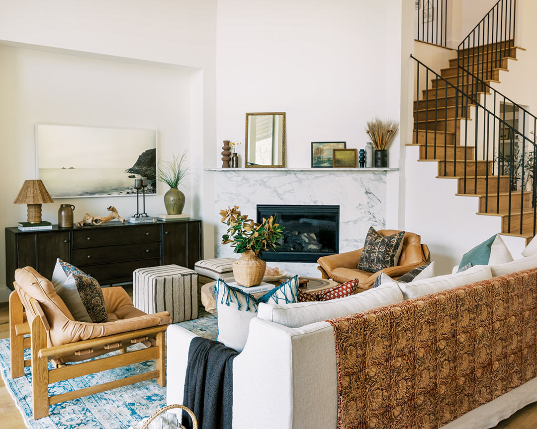
The open-concept layout allows for easy flow between the kitchen and living area. The same marble on the kitchen countertops can be found on the fireplace surround, which helps visually connect those spaces, while a mix of wooden furnishings in different tones creates balance without being too matchy. Audrey selected an oversize vintage rug to help anchor all her furniture. “I wanted a rug that would really maximize that space and make it feel as large as possible,” she says.

The primary bedroom is tastefully layered with color and pattern. Audrey intentionally kept the wall color white to allow the design elements to shine. A striped vintage rug brings interest to the space while a dark charcoal linen upholstered bed adds an attractive contrast. With the help of a local company, Audrey created a curved track system to suspend olive-colored linen curtains in the bay window. The nightstands were a fun find from the Rose Bowl Flea Market in 2015. “I love the age and character that those [pieces] bring into the space,” Audrey says. A finishing touch to the room is the custom chaise longue that adds a feminine flair. “I chose a really pretty mauve fabric that’s not too vibrant or saturated, and I grounded it with a vintage brass reading lamp that I found in an antiques mall,” she adds.

For the couple’s daughter, Tilly, Audrey created a room glowing with sweet shades of pink and a floral wallpaper on the ceiling that draws the eye upward. “It’s not so juvenile, and it’s something she can still grow into,” she says. “All of the colors selected for this space work off the earth tones in the rest of the house but in a more age-appropriate way for a 4-year-old.” The canopy was a creative addition to navigate an unusual cutout in the room. “Suspending that canopy really defined that space and allowed us to create a reading nook,” she says.

Outside, just beyond the main living area, the Schecks enjoy ample space for entertaining all season long. “Autumn in Austin is toasty,” Audrey says with a laugh. “But I do feel like bringing in the pillows and textiles will help [the space] feel more cozy even though it’s still hot.” An outdoor kitchen and table are set for guests, and their custom-built deck is truly an extension of the home, enclosing their hot tub while still providing plenty of usable square footage for their kids to play in the grass.

What started as a spec home is now anything but basic. Audrey’s creative design skills fashioned a custom home that’s layered with timeworn character, personal charm, and lots of love!


