As we usher in the new year, what better way to bid adieu to 2023 than a look back on our favorite trends that inspired us this year? Color is having its return to the spotlight and, unsurprisingly, makes our list—from vibrant hues to moodier tones. Whether it’s through upholstered fabrics or woven accents, texture is proving to be a key player as well when it comes to cultivating a cozy space, and our team is loving the new trends for weaving this essential element into your home. Check out the full list of our favorite trends below and find out what we hope to see more of in 2024!
Katie Ellis, Editor

Charming Nurseries: This year my husband and I welcomed a baby boy into our family, and we spent months thoughtfully preparing a nursery as we eagerly awaited his arrival. My husband happens to be the ultimate handyman when it comes to home projects, so he took all of my ideas—which included a custom closet system, textured wallpaper, a paneled wall treatment, and vintage summer camp themed decor—and turned a once empty space into something so beautiful and incredibly special to us. We found inspiration in many of the layered homes found within the pages of The Cottage Journal. One charming nursery that stands out in my mind is one designed by Texas-based Kim Armstrong featured in our recent Dream Cottages book. Kim’s stylish design eye for mixing patterns, prints, and color made a huge impact on us as we made our own cottage-style design choices full of personality and color!
Bethany Adams, Managing Editor

Texture on Texture: People are paying more and more attention to the tactile element of design, and it’s making all the difference in creating cozy spaces. From nubby linens, chunky knits, and velvet to wood grain, leather, and woven fibers, layering a variety of fabrics and finishes will instantly up the warmth in a home—and taking the sense of touch into consideration ensures that a design is just as enjoyable to experience as it is to admire.

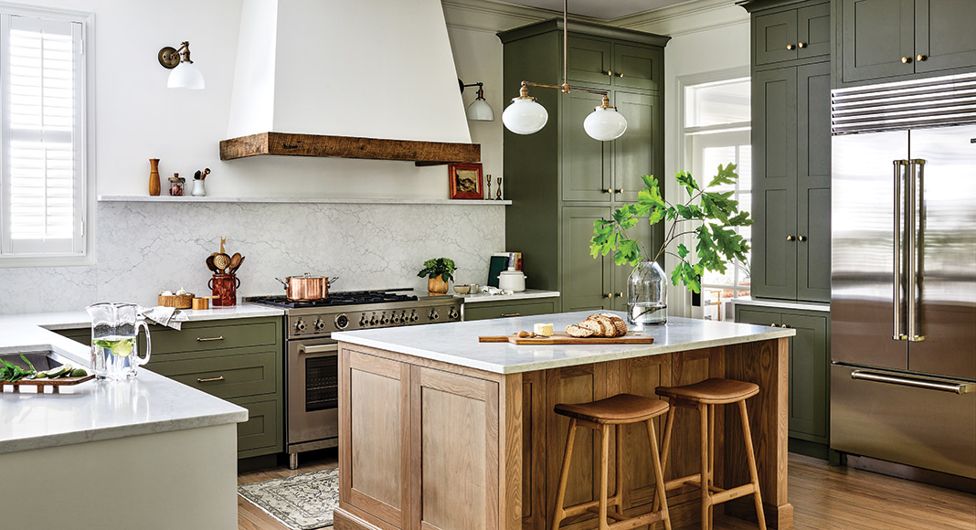
Earth Tones: Mossy greens, golden yellows, terra-cotta oranges… Earthy tones are sprouting up everywhere, and they perfectly complement cottage style. Personally, I love the way these subtle, nature-inspired palettes celebrate the beauty of the outdoors, all while making the indoors all the more inviting.
Elizabeth Czapski, Associate Editor

Blue Christmas: Specific to the holiday season, one of my favorite recent trends is a blue Christmas scheme. Year-round, my house is home to a lot of neutrals and notes of blue, so I’ve loved extending that into my holiday décor. The motif lends itself so well to a mix of old and new, and I’ve enjoyed collecting classic pieces like blue Wedgwood jasperware ornaments (also featured in this home’s blue Christmas room) along with more contemporary additions like Susan Gordon’s French blue holiday ceramics. One of my favorite finds is a nutcracker I happened upon at a little antiques shop in a small town in Washington that perfectly fits the palette.

Barbiecore: This was a surprising pick for me, since, as I mentioned above, blue is the beginning and end of my color comfort zone, and I normally steer pretty clear of pink. That’s worked out fine so far for my husband and son, but our family welcomed a baby girl this December, and it got me considering the realm of pink. While I do prefer a more subtle blush shade, seeing all the different Barbiecore looks throughout my pregnancy was fun timing with the trend and opened my eyes to some fresh and unexpected ways to incorporate the color.
Holly Seng, Assistant Editor

Saturated Schemes: While I’ve always been drawn to pastel palettes, I can’t help but find myself enraptured by the warmth and wonder saturated schemes bring to a design. When working on our Autumn issue, I was inspired when writing about interior designer Stephanie Sabbe’s retail storefront, Heirloom Artifacts, located in Nashville, Tennessee. Rich woods, deep hues, and layers of texture, lend extra cozy vibes that might just have me trading in my affinity for light and airy aesthetic for more grounded, enchanting design.

Woven Accessories: As we embrace more color in our homes, natural is proving to be the new neutral when it comes selecting accessories to pair with bold designs. Incorporating a few woven elements into a room adds both warmth and texture—all while blending seamlessly with your existing décor. Whether you’re looking to bring a contemporary touch to traditional style or enhance the casual and relaxed feel of a space, there are plenty of woven accessories that’ll do just the trick!
Shop our latest issues for more inspiration!


