Text by Holly Seng
After living many years in their 1935 residence and developing a change in taste, these Arlington, Virginia, homeowners decided to freshen up their traditional interiors—opting for a transitional aesthetic with subtle modern flair. With a style described as “where classic and modern hang out and drink gin,” Annie Elliott Design was the ideal firm for the redesign.

“We create fresh, delightful spaces that reflect our clients’ personalities and make them smile every time they walk through their door,” says Annie Elliott, principal designer and CEO. Working with a handful of existing pieces the homeowners wanted to keep, Annie set out to rework the interiors, highlighting the beloved furnishings in new and thoughtful ways.

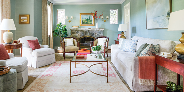
In the living room, Annie drew inspiration from the homeowners’ rug for a tranquil color palette. “Instead of emphasizing the warm colors in the rug, which the previous design had done, we pulled out the blue and green tones,” Annie says. An aqua grass cloth by Phillip Jeffries covers the walls, emphasizing the soothing scheme while furniture with classic lines and neutral upholstery imparts an ageless air.

Layering an orange-and-cream rug from STARK atop the original rug brightens up the design. Pillows and a few thoughtful accents in coordinating hues ensure the added warmth strikes a careful contrast and seamlessly blends with the surrounding scene. “There are dark orange accents elsewhere on the first floor, so introducing that color into the living room made sense,” says Annie.

The family room utilizes gray, beige, and rose tones, fostering a sense of intimacy within an open layout that includes the kitchen and informal dining area. A waterfall coffee table by Woodbridge introduces a new, playful texture with its shagreen top and sides. “The taupe of the sofa and rosy color of the rug and pillows are really variations of brown,” says Annie. “So, we have a cohesive look to the room.”

Although the kitchen is primarily white, gray accents and stained wood floors ground the design. Annie played off the soapstone counters by painting the island a deep charcoal. “Gray technically is a cool color, but I find soapstone, with its honed finish and patina, to be a warm material,” she says.

Leading to the main bedroom suite is an anteroom that had previously gone unused. Annie replaced heavy window treatments with semi-sheer patterned drapes and installed a blue velvet settee for a sunny spot to perch with a cup of tea.

When it came to the main bedroom’s redesign, the clients wanted a restful, serene retreat that felt updated yet made use of their traditional-style furniture. A white geometric rug and a palette of ivory, gray, and blue add a modern flourish. To keep things cozy despite the room’s high ceilings, Annie created a custom canopy for the bed using a sophisticated steel blue fabric by Romo.

Delightful color palettes and timeless textures mingle with handpicked modern flourishes for a space that better reflects the homeowners’ style.
Shop our latest issues for more inspiration!


