Skip to content Skip to sidebar Skip to footer


We’re not always proponents of decor for decor’s sake. But utilitarian, usable objects that happen to make an arresting display? Gets us every time.

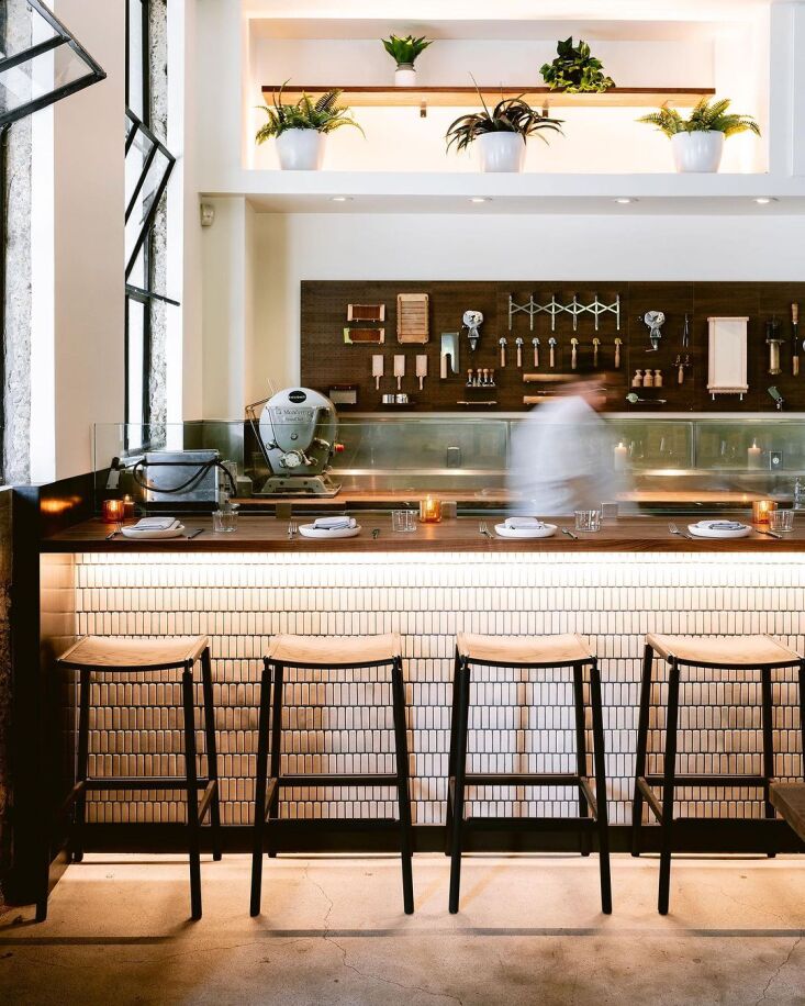
Case in point: the newly redone interiors at San Francisco’s Flour + Water Pasta Shop. When of Gavin Knowles of Berkeley, CA-based Knowles Architect was tasked with giving the shop an overhaul, the restaurateurs were working with a quick turnaround and a tight budget. So Gavin looked to the simple ingredients used to make the shop’s standout pasta and applied the same principles to the design: humble kitchen tools, elevated into focal point.

Have a look:


Photography by Kristen Loken.
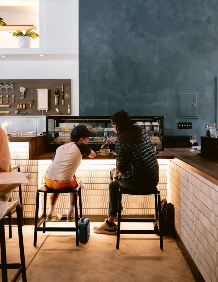
 

the new interiors by knowles architect. 14
Above: The new interiors by Knowles Architect.


behind the pasta counter, pasta making tools serve as display. and they&#8\ 15
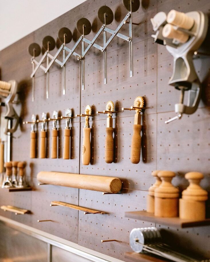
Above: Behind the pasta counter, pasta-making tools serve as display. And they’re not just for show: “They are all used by the chefs behind the pasta counter to make the pasta,” Gavin says. “The concept is that the process of making pasta from scratch is the thing on display in the space. The seats along the bar let guests watch and interact as the chefs make the pasta both for Penny Roma and Flour + Water down the street.”


tools are hung from simple brass nails slotted into a pegboard, and the display 16
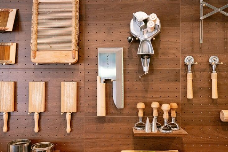
Above: Tools are hung from simple brass nails slotted into a pegboard, and the display can be adjusted as tools change.


the impact is in the simplicity—and the repetition of tools and shapes. 17
Above: The impact is in the simplicity—and the repetition of tools and shapes.


For more, or to stop in, head to Flour + Water Pasta Shop.

And more DIYs for the kitchen?


(Visited 1 times, 1 visits today)

Source link