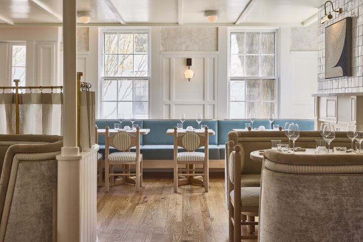
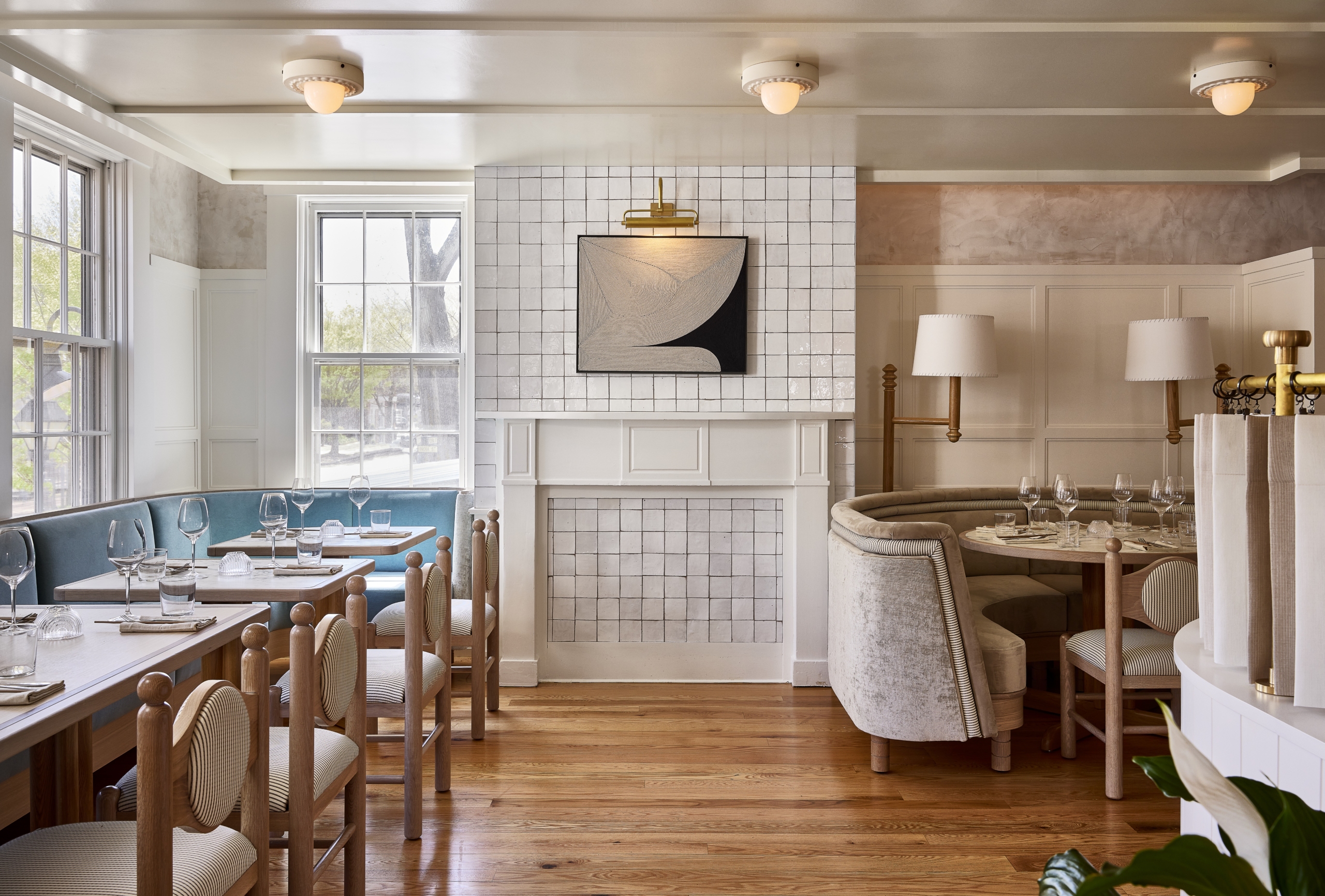
After three dormant years, Nantucket institution The Pearl has reopened with new management and an updated look that pays homage to the beloved restaurant’s previous three decades of service.
The refreshed interior—which mixes traditional millwork with contemporary furniture to bring the 1850s building into the 21st century—is the work of Brooklyn-based design firm Home Studios. Its founder, Oliver Haslegrave, spent a formative summer on the Massachusetts island as a teenager and took special care to reimagine this space while maintaining its welcoming essence.
“Especially in a small community, with a place that people really liked, the goal was definitely to preserve the spirit of it, to preserve the feel of an evening there,” he explains. “But we completely renovated. We changed everything, but we wanted to echo the kind of experience that people had at the original.”
Oliver kept the existing layout of the restaurant so it would seem familiar to diners. He also stuck with a neutral color palette but opted for warmer tones as opposed to the former cool hues—except with the aqua velvet banquette that nods to the oceanside locale. And he combined intentional architectural details with a variety of texture-rich materials to recreate the cozy vibe. Here are nine ideas to steal from the inviting space.
Photography by Matt Kisiday
1. Honor history with traditional millwork.
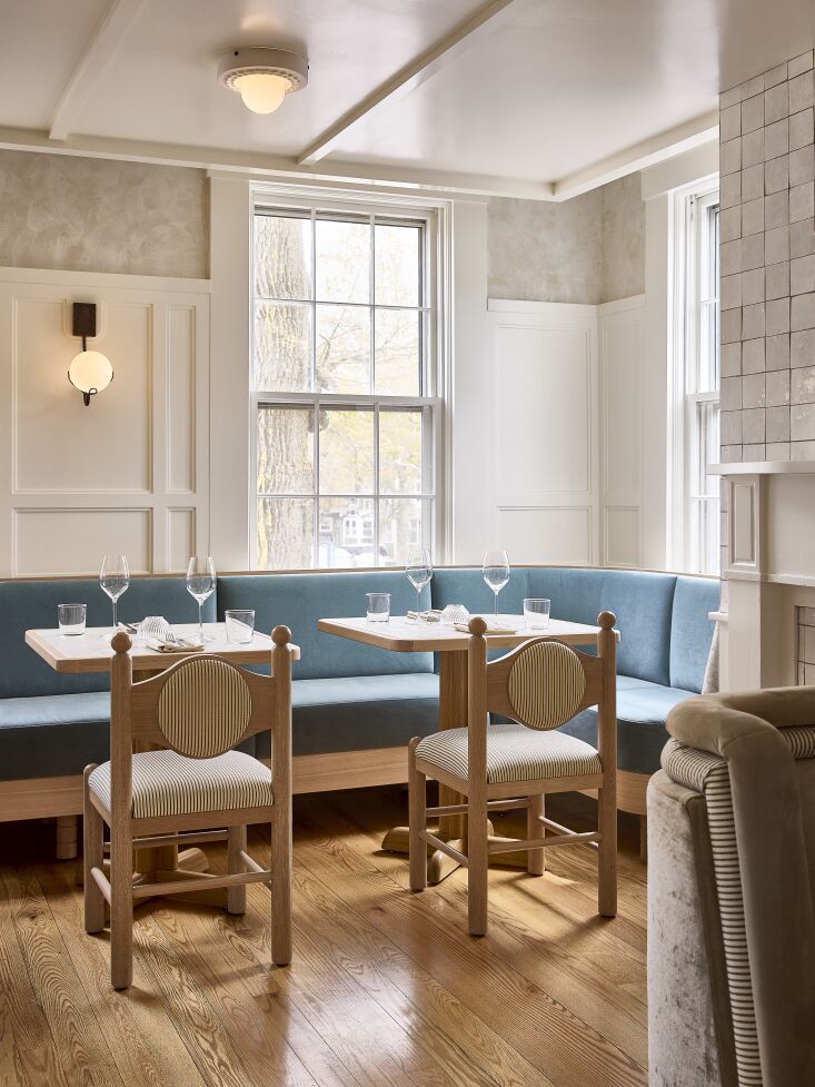
2. Experiment with a datum line.
