Skip to content Skip to sidebar Skip to footer


Situated among the sprawling wooded hills that overlook Tamales Bay, the Lodge at Marconi is a new Northern California retreat that occupies a series of former State Park buildings. The modernist Sea Ranch-style structures, which blend into the wild terrain thanks to olive green cladding and sloped roofs, were recently transformed into a 45-room hotel by Brooklyn-based design firm Home Studios.


The property’s tranquil interiors, with their abundance of wood and earthy textiles, were informed by the rugged destination. “We took a lot of inspiration from the tones of the natural landscape,” says Home Studios founder Oliver Haslegrave. “I think, given that the hotel is on 62 acres, that was inevitable.”

Oliver also infused the lobby, restaurant, and guest rooms with a playful summer-camp aesthetic. Everything, from arts-and-crafts-y furniture to accessible materials like canvas and brick, is left intentionally informal and rustic. “Generally speaking, camp is back to basics,” he says. “It’s stripped down—at least my camp experience was.”


That’s not to say Lodge at Marconi is spare; it’s most certainly not. There’s nothing superfluous, but nothing is amiss either. It’s simultaneously attainable and elevated.

Here are 12 design ideas to steal to strike a similar balance.

Photography by Brian W. Ferry.


1. Green is the new black.
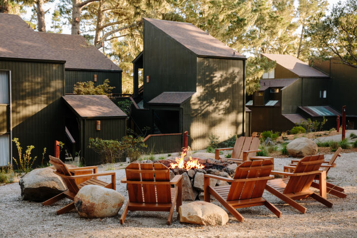
since the angular buildings were in solid condition, oliver didn&#8\2\17;t 12
Above: Since the angular buildings were in solid condition, Oliver didn’t make many updates to their exteriors. The one thing he did do was paint them all a deep olive green that acts as camouflage in the verdant environment. “It made a dramatic difference,” he says.

2. Mix materials, but keep the same tone.

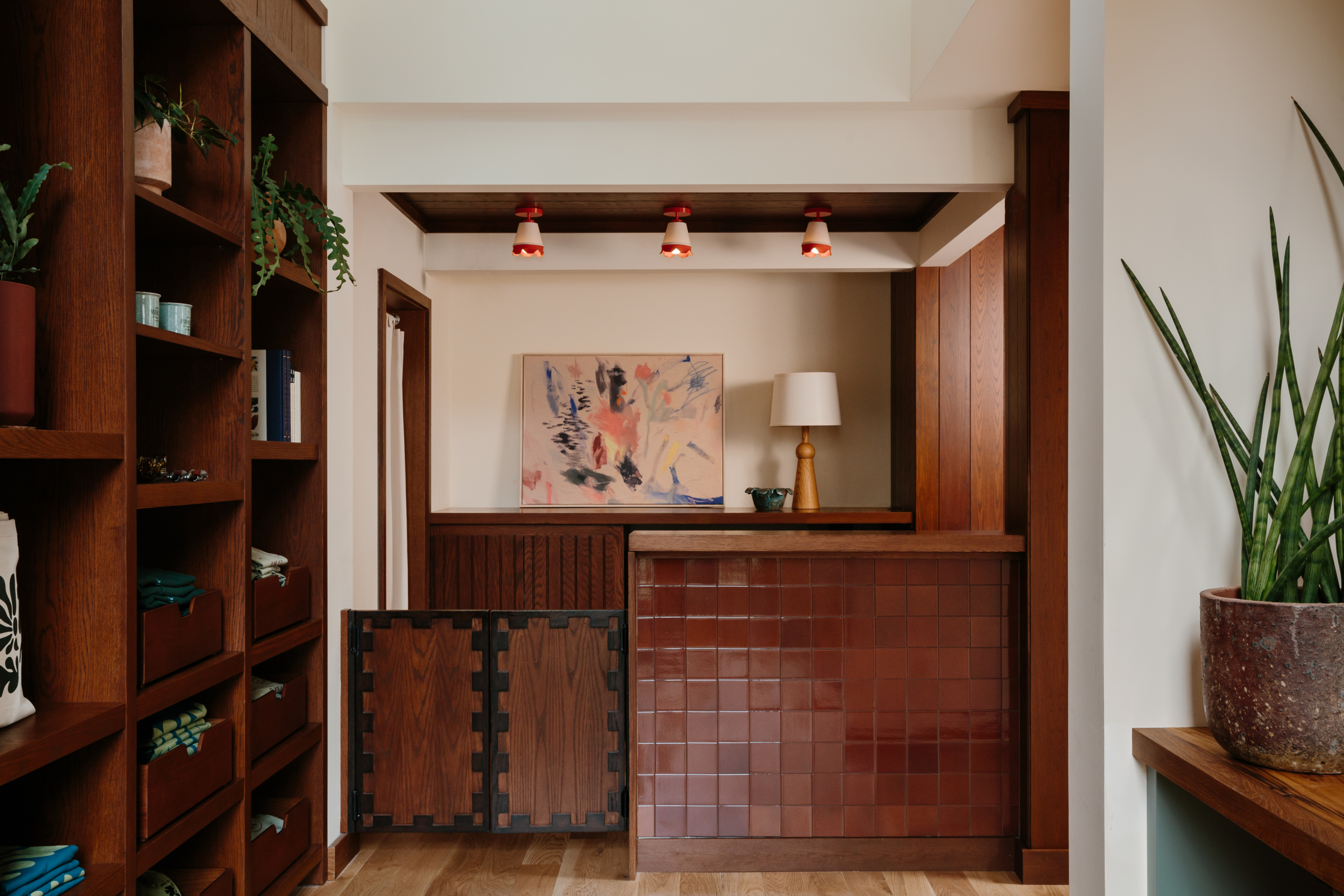
for the reception desk, oliver paired glazed brick tiles from heath ceramics wi 13
Above: For the reception desk, Oliver paired glazed brick tiles from Heath Ceramics with mahogany-colored wood for a rich tone-on-tone look. “Because it’s inspired by the natural landscape, there isn’t a lot of high contrast,” Oliver explains. “But I didn’t want to only use one material, so we created interest by mixing materials without changing the palette.”

3. Accentuate height with stripes.

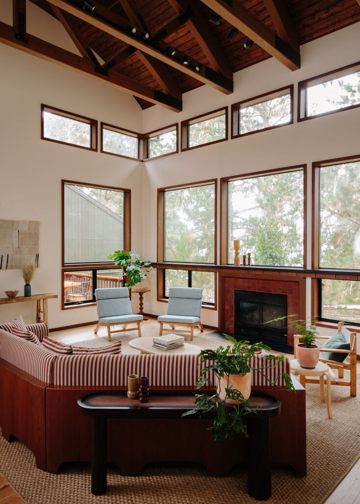
oliver designed a wood framed sofa with red and white striped upholstery to acc 14
Above: Oliver designed a wood-framed sofa with red-and-white striped upholstery to accentuate the height of the airy lobby. “This room has a lot of verticality to it, so the stripes felt in sync,” he says. “The couch is definitely the focal point, so had it been a solid color, it might not have had as much energy as we wanted it to, whereas a striped textile in a smaller room may have felt a little busy.”

4. Add playful window trim.

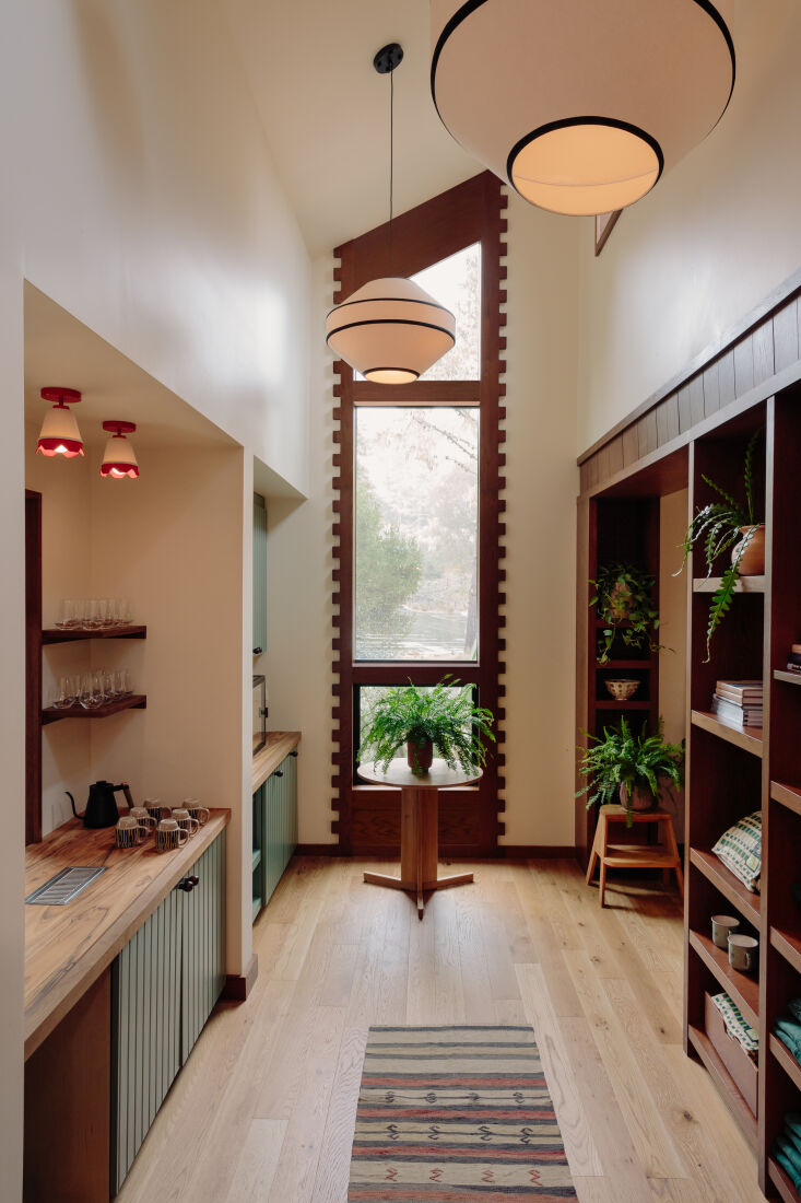
in the concession area, oliver framed a tall window with square dentil trim for 15
Above: In the concession area, Oliver framed a tall window with square dentil trim for a playful punch. That tooth-like geometry can be found in details throughout Lodge at Marconi, but it makes the biggest splash here.
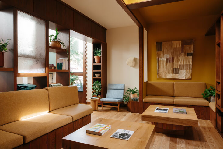
the adjacent lounge combines dark stained oak millwork and built in sofas with 16
Above: The adjacent lounge combines dark-stained oak millwork and built-in sofas with light, natural oak floors and coffee tables for added depth.

Source link