Text by Hannah Nance
Kelly Colby has a passion for all things old. A 1925 home, antiques and precious heirlooms passed down through family, classic colorways—time-honored items and details surround her. After Kelly and her family moved to a Tudor-style home right down the street from their previous residence in a historic neighborhood in Indianapolis, Indiana, it was obvious that the past was going to play a big part in the updated design of their new home.

And the designer Kelly enlisted to help her with the renovation was no surprise: her friend and boss, Tiffany Skilling. Tiffany shares Kelly’s love for classic style and vintage finds, and the two embraced the original beauty of the home while bringing the layout into more modern times.

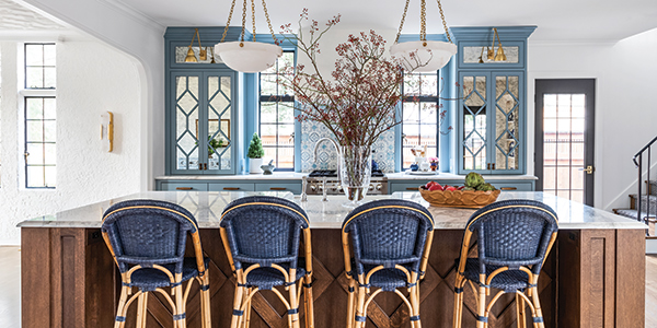
Tiffany and Kelly paid close attention to every detail during the renovation, working to preserve the architectural charm of the home, keeping and enhancing features like the arched entryways and plaster walls. “Determining where and how to continue the existing textured plaster in the newer spaces of the home did require a little extra legwork,” Tiffany says. “The original plaster detail is very unique and varies from the foyer to the dining room to the staircase—each space has a little bit different plaster texture—so working to make that cohesive in the newer spaces and figuring out where it made sense to pause or repeat the patterns was tricky.” Windows original to the home were transferred from another spot in the house to flank the range hood in the kitchen, as well. “Restoring the original windows and allowing them to ‘bring the outside in’ to each space—as we opened up walls where appropriate, selected soft, light colors—makes this redesign feel so good,” Tiffany shares excitedly. An intricately detailed wooden door that originally separated the dining room and kitchen was moved to enclose the laundry room. The duo kept the age of the home in mind while selecting upgrades like the starburst tiles in the laundry room and the antique mirror finish of the kitchen cabinets.

Even the classic blue-and-white color palette of the kitchen was inspired by the past. Kelly’s late mother-in-law owned an antiques shop, and she gave Kelly many prized heirlooms over the years, including the flow-blue china in her kitchen. Those pieces, combined with a collection of similarly hued canisters, led the way for the kitchen’s colorway—a feature that Kelly falls more in love with every day.

Practicality was also at the top of Kelly’s mind during the renovation. The pantry across from the kitchen island is a hidden alcove that stores some of the family’s most-used items and has evolved into Kelly’s husband Nick’s baking nook, complete with double ovens and his own sink. The laundry room was previously a garage bay that Kelly had enclosed.

The overall layout of the kitchen was debated more than once, namely the location and size of the island. One set of plans included the use of two small islands, but Kelly notes that the large island felt right for the space, and it’s now the perfect gathering spot for her family at any point during the day.

After renovating the home for months, the Colbys moved in during the fall of 2020, the perfect time to cozy up together in their old-but-new dwelling. And since they were surrounded by so many time-honored and meaningful details, it was easy for them to feel right at home almost immediately.
Shop our latest issues for more inspiration!


