Text by Bethany Adams
First impressions were of the utmost importance to March + May Design’s Rachel Anderson, who took the lead in furnishing Elizabeth and Jon Macklem’s cottage in the quaint Southern town of Fairhope, Alabama. The home’s open-concept layout left no room to hide, meaning the view from the front door needed to be a memorable one. “It was already such a charming foundation,” Rachel says, noting that the home was built by its previous owner, founder of Fairhope Building Co., who “put a lot of care into it.”

The goal, then, was to work within that foundation to create a space that would be personal to—and functional for—the young family. Layering atop the blank slate of white shiplap and rich hardwood floors, the team introduced a mixture of quality furnishings and more cost-effective accents, including performance fabrics that work well with the family’s young children. “It wasn’t an unreachable design, but it was also elegant and different and not something that everybody has,” Rachel says.

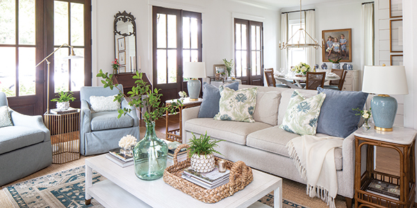
Paired with blue velvet, a floral pattern on the throw pillows in the living room heightens the neutral performance fabric on the sofa, as well as providing a starting point for the home’s palette. Side chairs in a soft chambray tone add more color to the space, and warmth makes an appearance in the rattan side tables topped with blue lamps.

In the same space, the dining room pairs old and new with a French-style chandelier from Gabby hanging over cane-back chairs reupholstered in a family-friendly faux leather. “I have it in my own home,” Rachel says of the material. “It’s so functional, and it looks good, and it stands up to about anything you can put on it.”

Ushering in a soft glow, a light linen fabric with a subtle stripe pattern dresses the windows. Matching the drapery in the living area, the fabric features a sage green Samuel & Sons trim, which Rachel describes as “simple but eye-catching,” and which raises an otherwise understated choice to a more elegant level.

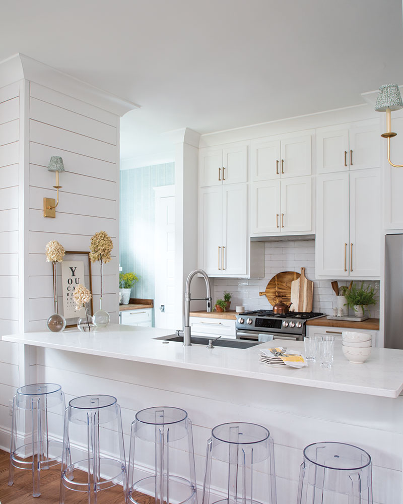
A contemporary touch nearby, acrylic barstools line the bar that separates the dining space from the kitchen, providing a spot for guests—or little ones—to hang out while Elizabeth and Jon prep dinner. Inside the kitchen, where white shiplap and subway tile infuse the space with an airy spirit, Rachel added warmth with wood accents and mixed metals. “There was a lot of chrome in the house before that wasn’t necessarily the clients’ taste. We swapped the hardware and sconce lighting with some fixtures in antique brass to bring the space together,” she says.

Peeking through the doorway, the butler’s pantry contributes a glimpse of cheerful color, as Rachel added a Thibaut wallpaper in blue and white. Surrounded by classic elements, she notes it’s “a little bit of something . . . to catch your eye as you’re walking by.”

The sky blue tones flow into the master bedroom, where, paired with a tufted headboard in a sandy tone, they create a spa-like experience grounded in details like the antique etchings over the bed. Ticking stripe on the curtains contributes subtle texture while calling back to the window treatments in the home’s main living areas, where a thoughtful design created a first impression that’s sure to linger.


