Text by Elizabeth Czapski
In need of a change after her husband passed away, Lucia Hillenmeyer found an ideal community in The Grove, a neighborhood just outside of Franklin, Tennessee, where she could live comfortably with her two Aussies, foster her avid golf hobby, and build the farmhouse filled with antique treasures that she’d always dreamed of—with the help of her go-to designer Connie Vernich of Nashville-based Vernich Interiors.

“We have worked together over the last 20 years on three different homes,” Connie says. “This new build is a classic Colonial-farmhouse style. We seldom see a [true] farmhouse style anymore. Everyone wants the modern-style farm home, but this home exudes charm and character from a bygone era. Over the years, Lucia has collected some very beautiful antiques and has a few pieces that her father built. Many of her antiques are simple and primitive, so the interior and exterior of this home meld perfectly.”

Lucia had a distinctive vision in mind for her farmhouse, which began at the foundational level with architectural features like exposed wood beams, wallpaper and wainscoting pairings, and eye-catching built-ins. “I’ve always wanted a farmhouse without the rustic appearance,” she says. “I would say my home is more of a farmhouse with an updated traditional look. I wanted to incorporate some family heirlooms and still have it feeling fresh.”

This diverse mix of furnishings and décor blends elements of old and new and finds harmony across a spectrum of blue and white warmed with rich wood tones and brass details. “Lucia loves the color blue, but because of her personality, I knew it had to be a bright and cheerful blue,” Connie says.

According to Connie, the key to such a committed color scheme is breaking it up with pattern, and they incorporated many—florals, stripes, plaids, paisleys, checks, and more. “Mixing these patterns was fun and worked nicely because they are all in the same color family,” Connie explains. “The antiques in Lucia’s home have beautiful walnut and natural cherry woods, and bright blue is the perfect contrast.”

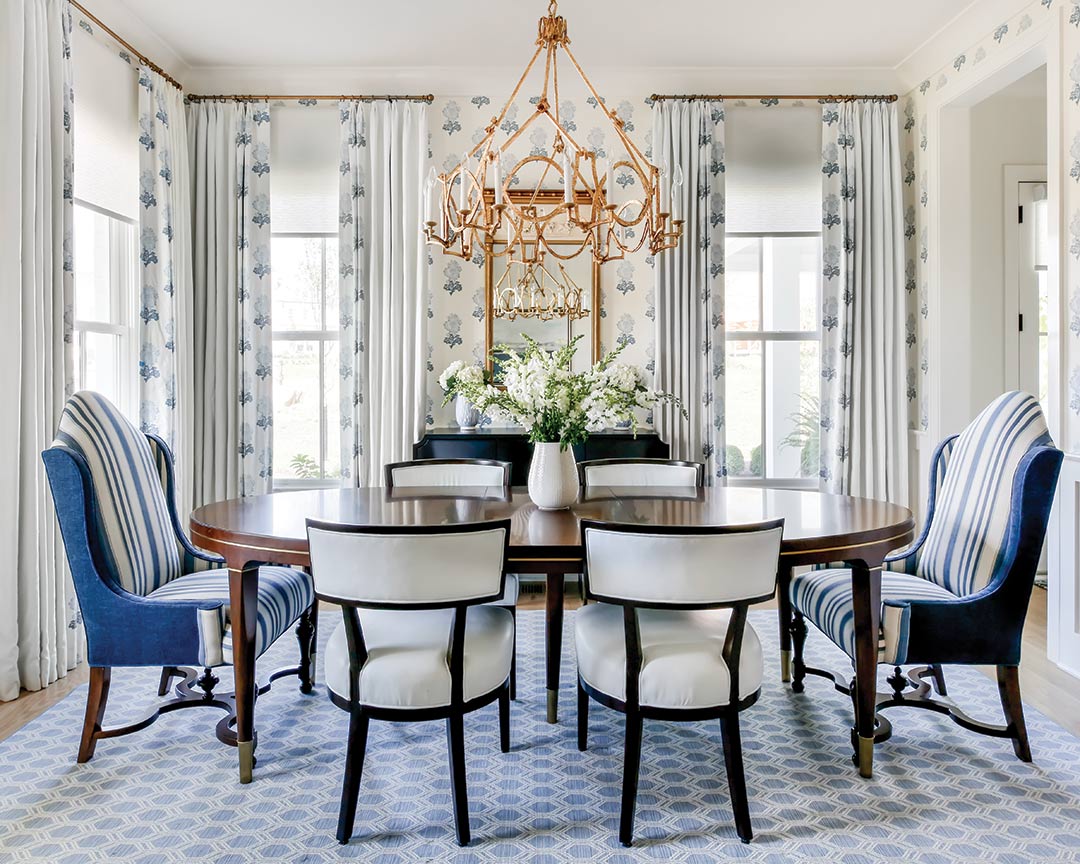
This is immediately evident in the entryway, where an old wooden table built by Lucia’s father and a skirted royal blue ottoman make a welcoming dynamic duo. The dining room upholds the traditional tone with a few fun inclusions like a floral wallpaper above board-and-batten, a geometric-print rug that grounds a neoclassical table setup, and a navy lacquer console topped with an ornate heirloom mirror.

“My favorite piece in the room is the antique corner cupboard filled with a collection of pewter and silver,” Connie says of the fixture that was crafted from wood harvested from Lucia’s family farm in Kentucky to create an exact replica of a cupboard her great-great-great-uncle originally built.

Contrastingly, the library boasts the most daring design in the home. Cloaked in a dramatic blue-gray hue pulled from the room’s antique rug, an accent wall is bordered with unique built-ins that house books from Lucia’s childhood, passed-down family pieces, and eclectic accessories ranging from her father’s ukulele to contemporary knickknacks.

“The one room with strong color that stands out from the rest of the home is the library,” Connie says. “We added lots of texture and pattern to give it a very warm and cozy feel. I love to add edgy touches to a traditional room by bringing in art or objects that are fun and modern.”

A light and airy ambience waits in the living room, which leads directly to the kitchen and breakfast room, and with the open, easy flow between them, several design elements echo across the sprawling space. A few shades lighter than the library, blue built-in bookshelves in the living room mirror the tint of the kitchen island, and sheer draperies with an abstract cobalt print imbue a softening sense of whimsy throughout.

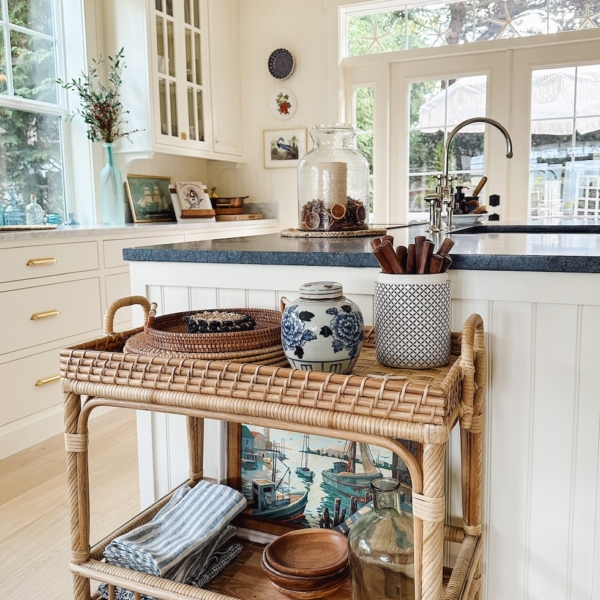
The classic white kitchen is clean-lined and functional, but meaningful artwork, like an oil painting of Lucia’s family farm, and vintage brass accents instill warmth.

The bedrooms resume the blue-and-white motif but with a more tranquil approach using gray undertones. “Blues can be very intense or very quiet, and in this case, we were leaning toward the quieter, calming color palette,” Connie says. Bed frames spanning walnut and iron lend depth, while Oriental rugs pull in restrained yet enriched background color.

Through every thoughtful space, Connie worked to keep her client at the heart of the design, and the result is a home perfectly tailored to its owner. “[What] stands out about this home [is] Lucia and her vibrant personality and collections from family that make this home uniquely hers and uniquely Lucia,” Connie says. “I want people to walk in and say, ‘I knew your house would look like this. It’s so you!’”


