| Published on
Paint colors have a significant impact on any room, but selecting the right one can be challenging. Interior design trends, like everything else, influence paint color choices. Every year, a new slate of outdated paint colors emerges, and a fresh new palette influences the choices of homeowners, decorators, and designers.
It is clear that paint colors are more than just pigment on a wall; they can be an effective expression of personality and style. Because this is true, selecting a wall color should be a personal decision. Consider paint color trends, but most importantly, choose a color that reflects who you are, regardless of the prevailing style or other people’s tastes. Fortunately, paint is simple to change, making it an excellent way to update your space with just a paint brush and some DIY skills.
Outdated Paint Colors
Outdated paint colors reflect a previous era’s design aesthetic, and what was once fashionable is now out of style. While paint trends can help you decide on a color, the final decision should be based on your personal preferences and the look you want to create in a specific space.
Some Shades of Gray

Gray was one of the most lasting paint trends in recent history, and it shows. From gray walls and ceilings to gray accessories, designers couldn’t get enough of this cool color shade. Recently, color trends have been moving in a warmer and more earthy direction. Many gray colors appear cold and uninviting, which is the opposite atmosphere that we want to create in our personal spaces.
This is not to say that all grays have disappeared from the interior design landscape. Warm and more nuanced grays are still a powerful color tool in the home decorating arsenal. Rather than choose cool, one-dimensional gray tones, look for warm grays that are calm but yet adaptable to colorful and textured decor and accessories.
It is also helpful to integrate gray elements with warm color tones like wood and brass. Some warm and easy to blend gray paint options are Classic Gray (OC-23) and Balboa Mist (OC-27) from Benjamin Moore and Repose Gray (SW 7015) from Sherwin Williams.
Stark White

Just as cool shades of gray can appear uninviting, so too can stark shades of bright white. While bright shades of white can look stunning in certain contexts, they do not work everywhere or in all homes. Beyond just feeling too harsh for real life, all white walls are notoriously difficult to keep clean. Instead, many people are turning to more natural shades of white and off-white for a more natural and organic look.
Consider more nuanced shades of white, like White Dove (OC-17) from Benjamin Moore, Snowbound (SW 7004) from Sherwin Williams, and Schoolhouse White (No. 291) from Farrow & Ball. All of these options still appear white on the walls or ceiling but are more serene than bright white. They also have enough depth to work well with warmer tones and natural textures.
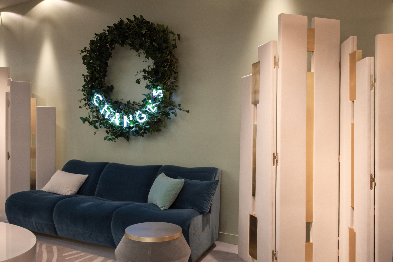
Always Navy

Navy has been a popular interior design color for the past several years. While navy will always be a timeless and classic paint color choice, many decorators are leaning into more nuanced and variable shades of blue.
Because blue is one of the biggest trends of the year, there is such an amazing variety of blues that you can consider. A distinct shade of blue is the color of the year for both Sherwin Williams and Benjamin Moore in 2024. Blue Nova (825), Benjamin Moore’s color of the year, is an alluring, periwinkle blue. The Sherwin Williams color Upward (6239) is a pale, silvery blue with a soothing quality.
Barbie Pink

First it was Millennial pink, and then it was Barbie pink. Both of these colors struck a particular chord with the generation and captured a specific era of time and space. But these moments have passed and left a pink void in their place. Pink is still an excellent option inside your home.
Pink occupies a broad spectrum of shades, from delicate blush to rose and bolder magentas. The diversity of shades offers flexibility in choosing just the right one to fit the room and mood you want to create. Some of the most popular pinks today include Farrow & Ball’s Dead Salmon (No. 28), Pink Ground (No. 202), and Setting Plaster (No. 231), as well as Bashful (1171) from Benjamin Moore.
Pale Green

Pale shades of green, like mint and sage, have been popular for many years, and rightly so. These tones are soothing and versatile and lend a fresh and earthy appeal to any space, but interior designers and homeowners have been moving toward darker and more vibrant green hues for the past several years, and this trend will continue.
Many people are drawn to deep green tones, which work beautifully in small and large rooms and on cabinetry and shelving. Consider deep and versatile shades of green, such as Green Smoke from Farrow & Ball, Salamander (2050-10) from Benjamin Moore, and Cascades (7623) from Sherwin Williams.
Breakfast Room Green from Farrow & Ball is another gorgeous green paint color, but one that is brighter and more vibrant than the previous selections. Another popular green color tone is olive, which can be both sophisticated and relaxed at the same time.
All Neutral Room Color

Neutral colored rooms can exude simplicity, sophistication, and timeless elegance, but if you don’t incorporate contrasting tones, the space can lack depth and interest. Neutral spaces can also feel too safe.
Designers and many homeowners are looking to create more visually stunning spaces that reflect the personalities and lifestyles of their clients and themselves. They are doing this by using rich and textural colors not only on the walls but also on the ceilings and trim. Color saturation of whole rooms is a powerful paint trend this year and beyond.
Red

There is nothing neutral about red rooms, and designers are mixed on the staying power of red paint colors. Many view them as dramatic and optimistic, while others find them just overwhelming. Either way your opinion on red lies, it is easiest to work with rich and earthy reds rather than bold and brilliant options.
Try options like muted terracottas or earthy burgundies. These colors blend beautifully with other supporting colors, rather than stealing the whole show. Some particularly beautiful and accessible reds are Farrow & Ball’s Book Room Red (No. 50), Red Earth (No. 64), Porphyry Pink (No. 49), and Wild Currant (7583) from Sherwin Williams.
Overly Bright and Saturated Colors

Saturated and bright colors were all the rage last year, but it was quickly apparent that these types of colors have a short shelf life. While they exude energy and excitement, they lack the comfort and coziness that we all seek in our homes today.
Many of today’s most popular colors include a healthy dose of gray, which can significantly reduce a color’s saturation, making it easier on the eyes and more likely to age well. If you still prefer rich and vibrant tones, you are in luck. Those colors are still trending in a big way this year; just look for color formulas that include some gray or black, which makes the color more livable over time.