Living room paint colors are essential for defining your style and setting the tone for your entire home. Certain colors, which were once elegant and inspiring, now feel dated and uninspired. These outdated living room paint colors can make your living room feel out of touch and lack the vibrancy that contemporary aesthetics demand.
Refreshing the paint colors in your living room is a simple way to revitalize its appearance and shift the tone of your home in an inspired new direction.
Outdated Paint Colors and Alternatives
Color trends come and go, so the best strategy for choosing a living room paint color is to pick a color that you enjoy. Colors chosen for personal preference will last the longest and bring you the greatest joy in your home.
This list is based on colors that are currently out of style. Even if your favorite color is on our list of outdated options, there is a good chance you can find a similar color that you like just as much but has a fresher, more modern look.
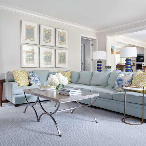
Bright White

While neutrals are losing popularity in today’s color palette, this does not apply universally to all neutral shades. Bright white, once a popular choice because of its clean, minimalist aesthetic, now feels cold and lacking in depth. Homeowners and decorators are shifting away from cool, stark whites and towards warmer neutrals. Popular neutral color choices now have a touch more color depth, reflecting a new emphasis on comfortable and inviting style.
If you still love white, consider painting your living room an off-white color like cream, ivory, or a pale greige. Colors like White Dove from Benjamin Moore and Salt from Farrow & Ball will still appear light and bright on your walls, but the addition of a small amount of color will add visual depth and texture.
Dark Navy

Navy is and will always be a classic color choice for any room of your house. However, there has been such an oversaturation of dark navy paint colors in home design that interior experts are looking for other exciting alternatives. Dark navy also has a tendency to look staid and traditional, so designers are seeking ways to make interiors more versatile and dynamic.
Dark blue still provides some stunning options to consider. Deep blues come in a wide range of shades, including slate blues with a strong gray undertone or indigo with a touch of purple. Shades like Blue Note from Benjamin Moore and Grays Harbor from Sherwin Williams retain the depth and elegance of navy but with a softer and more contemporary edge. In addition, there are other blue hues that are more vivid and eye-catching, such as cobalt, peacock, cerulean, and royal blue.
Rose Pink

Rose pink, once popular for its romantic appeal, now appears more nostalgic than contemporary. Pink is still a popular color for living rooms, but the best pinks now incorporate a touch of salmon or brown to add depth and sophistication. These pinks retain the warmth of older pink shades while having a more modern, earthy feel.
Consider popular choices today, like Farrow & Ball’s Setting Plaster and Templeton Pink. Other current favorites include Malted and Pueblo by Sherwin Williams. These Sherwin Williams pinks seamlessly blend beige and pink, making them an excellent choice for an elegant living room with whimsy.
Tuscan Yellow

Tuscan yellow, once popular for its sun-kissed vibe, has become an outdated living room color. Tuscan yellow, like mustard yellow, is intense and overwhelming. These heavy, rich yellows are too overwhelming in today’s modern, clean interiors.
Instead, homeowners and designers who want yellow are opting for lighter, more muted shades. These yellows still provide warmth, but they are more understated and versatile. Soft, buttery yellows are both cheerful and inviting. Pale lemon yellows have a crisp, modern appearance that adds a touch of brightness and can make a room feel more spacious and light. Consider Farrow & Ball’s Dayroom Yellow or Benjamin Moore’s perennial yellow favorite, Hawthorne Yellow.
Forest Green

Forest green is a timeless color choice, beloved for its moody depth and visceral connection to nature. Because it is such a lovely color, we have seen it on every design blog and in all areas of the home, from kitchen cabinets to living room walls. Like every design trend, once it becomes oversaturated, interior designers move on to other colors to give spaces a fresh and exciting style.
Mid tone greens are a good alternative to forest and other deep greens. These greens still have depth, but look fresher and more dynamic. Consider colors like Calke Green and Breakfast Room Green from Farrow & Ball if you want a vibrant, lively green. Verdegris from Benjamin Moore is a striking mid-toned green with a strong undertone of blue.
Cool Grays

By now, everyone has gotten the message that gray is out. But that is not the whole story. Gray has a wide variety of undertones that can completely change its appearance. While cool grays with blue and purple undertones have fallen out of favor in home decor, warm grays and grieges remain popular.
Even though most people are tired of overused warm grays like Benjamin Moore’s Edgecomb Gray and Sherwin Williams’ Agreeable Gray, there are still plenty of warm grays to choose from. Consider updated warm grays from Benjamin Moore, such as Balboa Mist and Seapearl. These colors remain neutral and versatile, but their soft, warm undertones appear fresh and modern.
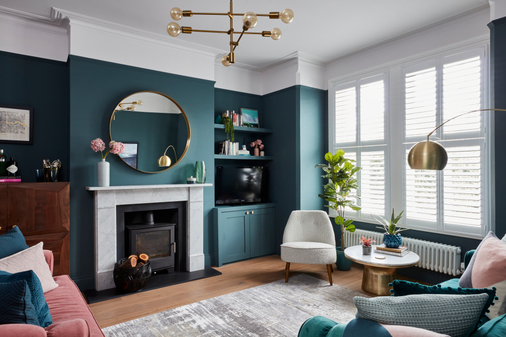
Teal Green

Teal green is a distinctive blue-green color combination. The beachy, tropical vibe of this color will create a distinctive look in the living room. Teal shades are a range of bleu-green combinations that can work well in living rooms, but other greens will be easier to work with and go more naturally with contemporary, organic design.
Consider options like earthy sage and eucalyptus. Some of the most popular light, earthy greens that work well in living rooms include Pewter Green, Retreat, and Clary Sage from Sherwin Williams, and Hollingsworth Green from Benjamin Moore.
Sky Blue

Light blues will remain a favorite in interior design, and for good reason. Light blue is abundant in nature, particularly in crystal blue water and the early morning sky. However, when choosing sky blue, you must exercise caution because it can appear cold and uninviting. Instead, choose a light blue with just a touch of green. This will give the color more depth and interest and make it more versatile in your design. You can also look for light blues with gray undertones, which can make the color look more grown-up and sophisticated.
Some perineal favorites include Sea Salt from Sherwil Williams and Pale Powder from Farrow & Ball. These colors are blue, but they can read as light green or gray, depending on the light. Light Blue is another Farrow & Ball favorite that is a versatile silvery blue.
Black

Black is a timeless color and will always have a place in home and living room design, but stark black can look dull and lifeless on living room walls. Instead, choose a deep gray with a touch of warmth to make your space moody yet inviting. Some popular dark gray paint colors include Railings, a black with a strong hint of blue, from Farrow & Ball, and Kendal Charcoal from Benjamin Moore, a warm gray with balanced undertones. Deep gray colors like these will still provide a dramatic look in your living room but offer more depth than stark black.