Interior designer Nicola Harding approaches remodeling projects with a one-two punch: “The first thing I do is plan the use of space, quite often reorganizing the way parts of the house are used,” she tells us. “Then I assign paint colors. I understand this is different from the way most decorators work, but, for me, the choice of color is fundamental to unlocking the potential of each space.”
Harding feels this way, no doubt, because she’s so attuned to the mood enhancing of powers of her paint palette. Safe, predictable choices aren’t for her: the London designer, who goes by Nix, loves to invite in an unexpected mix of subtle and decidedly bold hues: see, for instance, Mamma Mia Producer Nick Gilpin’s Stylishly Revived Georgian Manse and A Classic English Country House with an Injection of Color.
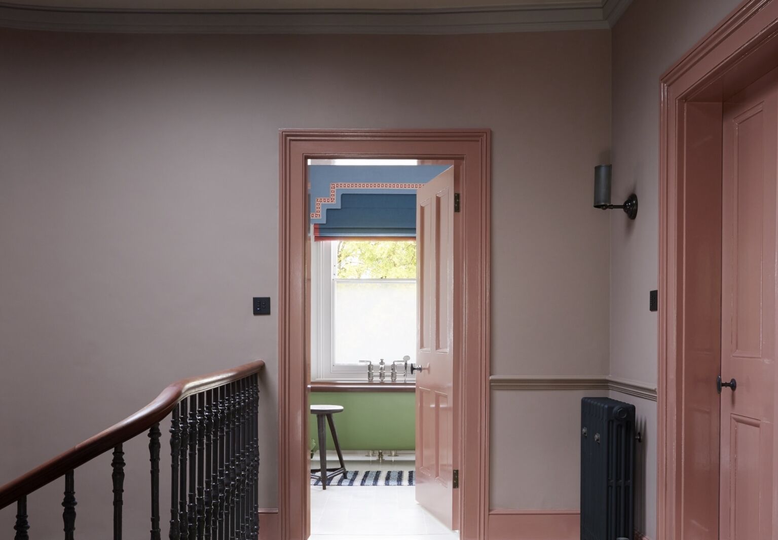
Having admired Harding’s dare-devil choices for so long, we decided to ask her to enlighten, and perhaps embolden, us with her way of thinking. As a case study, Harding presented a recent project, an 18th-century house overlooking the Thames on the outskirts of London that she was charged with transforming into a young city family’s weekend retreat. A “soulful and easy atmosphere” was the directive, and a crucial way Harding achieved this was through her use of color.
Photography by Paul Massey, courtesy of Nicola Harding & Co.
1. You can’t go wrong with green

In this case, leaf green, cerulean blue, lively reds and pinks, and rich browns set the tone. The colorful prints over the sideboard are by Hormazd Narielwalla via UK art site C&B Curates.