Interior design rules are the guiding principles for how we arrange and decorate harmonious and functional living spaces. From adhering to color guidelines to arranging the furniture symmetrically, these rules have been regarded as essential for creating a visually appealing and cohesive design.
However, there is an emerging trend that there are some interior design rules that have become outdated. Departing from these interior design rules allows for greater flexibility, personal expression, and creative innovation.
While interior design rules are there to provide a solid foundation for design, breaking them can result in unexpected results and a more striking design.
Interior design rules exist to assist us all in creating beautiful, comfortable, and visually appealing homes; however, we can become so enslaved to the rules that everyone’s homes begin to look the same. Think about how you can add your own unique touch to interior design, starting with knowing these antiquated guidelines that can no longer determine the final look of the space.
Following Trends Blindly

While keeping up with design customs and trends can be instructive and beneficial, blindly following them without considering one’s own style or available space can result in dated and boring designs. Further, trends shift swiftly, so what is in style now might not be in a few months. Designers and homeowners who strictly follow trends risk creating spaces that lack timeless and classic appeal.
Instead of blindly following interior designs, new ideas are emerging for creating a space that reflects the users’ personal preferences and lifestyle. Designing with a focus on longevity and uniqueness allows for greater adaptability, ensuring that the space remains relevant and inviting for years. So, while staying up to date on interior design trends is essential, you should always use them with caution and discernment.
Painting Ceilings White

In building and interior design, painting ceilings white has long been considered common practice. White ceilings became popular for a variety of reasons, including their ability to reflect light and create a greater sense of height in the room. White or light neutral colors may still work well for ceilings in some designs, but white is not always the best option. White highlights rather than concealing moisture damage or stains in rooms prone to these issues. It is also a generic look that does not make a statement.
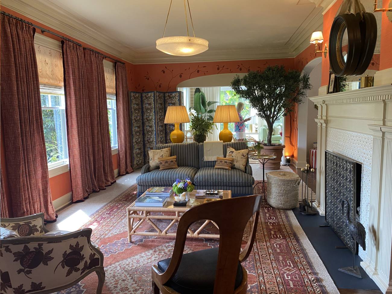
Designers and homeowners are starting to consider ceilings as a fifth wall in terms of color and pattern. To create a striking visual appeal, many are adding wallpaper or painting the ceiling the same color as the wall, or even a darker shade. Another strategy is to add molding to give the surface depth and texture.
Stick to the 60-30-10 Color Rule

The 60-30-10 color rule has been a popular interior design guideline for many years. This rule suggests allocating 60% of a room’s color to a dominant hue, 30% to a secondary color, and 10% to an accent color. While this is still a helpful principle, it is overly formulaic for today’s interior design culture and can limit innovation and creative expression.
Modern interior design favors unconventional color combinations and pairings that reflect more personal approaches. Certain interior design styles favor more minimalist and monochromatic color schemes. Others prefer a maximalist approach, where multiple colors are elevated to the same level. Embracing this more fluid and nuanced color concept allows for greater flexibility, creativity, and self-expression, resulting in more vibrant, engaging, and resonant spaces.
All Wood Stains Should Match

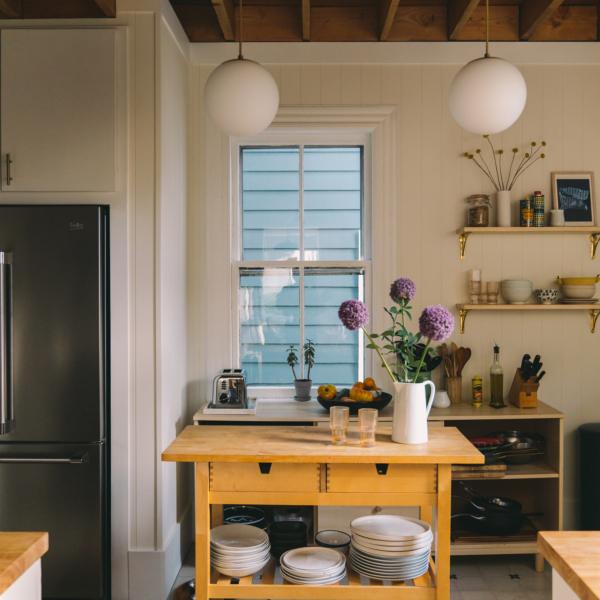
Adhering to a single color of wood stain was a rule intended to create cohesive and harmonious spaces. One of the main disadvantages of this method is that it can produce a monotonous and uninteresting aesthetic. This rule can also limit creativity, as designers may avoid certain furniture and decor due to the “wrong” stain color. This can be a difficult rule to break because combining furniture with different wood stains can feel off, but a better approach is to layer pieces with different stain colors throughout the room. This will result in a design with more depth and an organic appearance.
There are some best practices for combining wood tones. These are not hard and fast rules, but they will help you mix wood stains more successfully. First, while mixing wood stain colors is effective, it is best to stick to wood colors that have the same undertone, either warm or cool. Choose one light, medium, and dark wood stain to use in the room. Finally, try to use the same wood color more than once throughout the design.
Avoid Mixing Multiple Patterns

Minimizing the number of bold and strong patterns in a room has long been thought to be the most effective way to avoid visual overload while maintaining cohesion and harmony. Mixing multiple patterns throughout a room is difficult to do well, and it can make a room feel overly stimulating, but this rule can also limit creativity.
The use of multiple patterns and textures in a single design is consistent with the growing popularity of maximalist design, but it also provides greater flexibility to everyone. Bold patterns add layers of interest and intrigue to create personality, drama, and excitement. In addition, contrary to popular belief, using multiple colorful patterns in a room can actually promote unity. By varying the scale, texture, and color of patterned furniture and decor, designers can create visual interest without overwhelming the senses.
Don’t Layer Rugs Over Carpet

Placing rugs over carpet has long been discouraged in interior design circles because rugs rarely lay flat on carpet, and some believe that rugs make a carpeted room appear visually cluttered. Yet, there are multiple advantages to breaking this design rule. We all know that carpet can become stained and discolored long before you are ready to replace it. A strategically placed rug can conceal rug damage and keep new stains from appearing. Rugs can also add warmth to a room, making it more colorful and inviting.
Here are a few things to think about when placing a rug on carpet. Most advocates of this strategy believe that flatweave or very low pile rugs look best on carpet. Low pile rugs like dhurries and kilims lay the flattest on carpet surfaces. Others suggest that you should try to vary the color between the carpet and the rug. This will create a visual distinction between the two. Finally, make sure the size is appropriate for the area. Choose a rug large enough to accommodate the front legs of all of the furniture in the area.
Stick to a Cohesive Design Style

As with all interior design rules, designing a room with furniture and decor in the same design style can result in a room that feels cohesive. It is also a more straightforward approach than considering multiple styles. However, matching your furniture and decor to a single design style is no longer the only option.
With a growing emphasis on new design styles like eclectic modernism, bohemian chic, and organic modern, current design trends favor more personalized and eclectic design. This means incorporating furniture and accessories from a variety of design styles. Instead of merely designing a layout that looks good, this approach involves creating environments that truly represent people and how they use their space.
Wall Art at Eye-Level

Hanging wall art at eye-level is an excellent interior design guideline that ensures that art is easily visible and accessible to the majority of people. However, there are several reasons why this rule should not be the only approach you take when it comes to wall art. Like all helpful interior design guidelines, they exist for a good reason, but they can stifle creative expression.
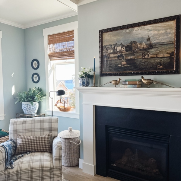
Interior designers and homeowners are exploring new ways to display art. When art is hung at eye level, it can result in a predictable and stale display; hanging or displaying art lower or higher than standard can add emphasis. Before deciding on the best placement, take into account the room’s architectural elements, furniture, and individual pieces of wall art. Some art may look better leaning against a wall on shelves or furniture than hanging at eye level.


