Renovating your home can be a time-consuming and expensive process (I should know; I’ve been slowly working on my 1880s house outside Boston for years now).
But you’d be surprised by how easy it is to refresh a room with just a few simple tweaks. I was reminded of this fact when I volunteered to help a friend get her house ready for a party. Ostensibly, I was on hand to make the flower arrangements, but I couldn’t resist the urge to move a few things here and there. Before I knew it, we had completely transformed the look of the place, all within a couple of hours and without buying anything new.
None of the things I did would qualify as groundbreaking design, but what a difference it made. Sometimes even the simplest design tenets bear repeating.
1. Rehang your art.

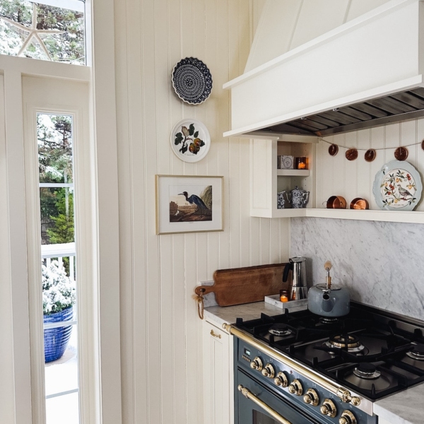
One of the most common design mistakes I see is art that is hung too high. Rule number one with art, it should “relate” to the object(s) around it. I subscribe to the idea that, generally, pictures should be at eye level; you should never have to look up to view art (unless it’s hung over a tall object). My aunt Sheila, an architect, uses her windows as a guide, hanging art so the middle of the pictures hangs in line with or only slightly above the center of the windows.
Since eye levels and window heights vary, another good principle is that art should be viewed as part of a larger composition. For example: If you are hanging a single piece over a desk, it should be hover over the desk, creating a dialogue between the two pieces. If you are positioning a piece over the couch and next to a tall floor lamp, it should rest in relation to both so that it balances out the composition of the three objects.
Another picture principle: Have you ever noticed that the catchiest tunes have recognizable patterns along with periods of rest and syncopation? The same maxim applies to good design. So instead of hanging a single work of art on each wall, compose a dramatic crescendo by grouping several pieces on one wall, while at the same time creating periods of rest by leaving other walls blank.
2. Give your furniture room to breathe.

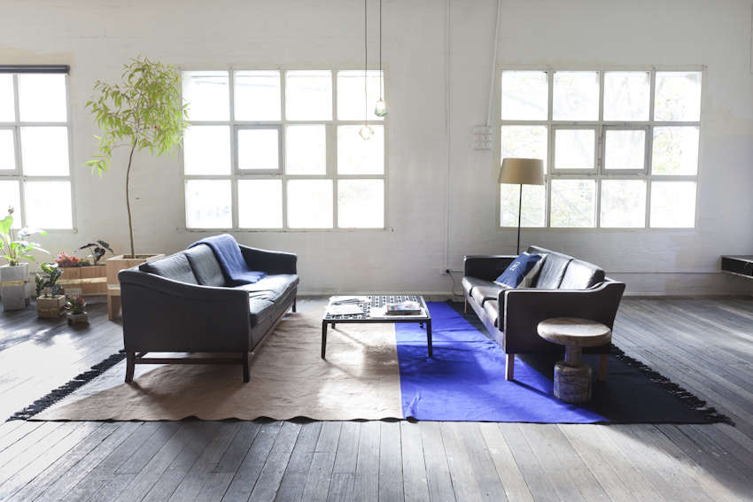
As with pictures, with furniture the goal is to craft harmonious relationships within a space. Create more of a conscious grouping by pulling furniture away from walls and out of corners. You will notice a greater sense of intimacy within the space, as well as an airier quality.
3. Apply circular thinking.

As a former dancer, I believe that all movement, or at least the energy created by motion, occurs within a series of circles, not as straight lines (kind of like the image of Da Vinci’s Vitruvian Man). The same can be said with design. When arranging your furniture, you can create a similar circular dynamic, not by literally placing pieces in a real orb, but by imagining that each is held in place by a kind a centrifugal force. (Note that this concept also works on the horizontal plane. Can you see how the objects in the picture below create a cyclical effect?)
4. Create visual transitions.