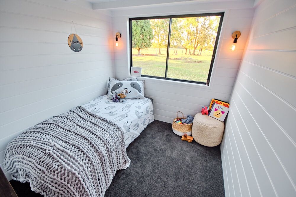
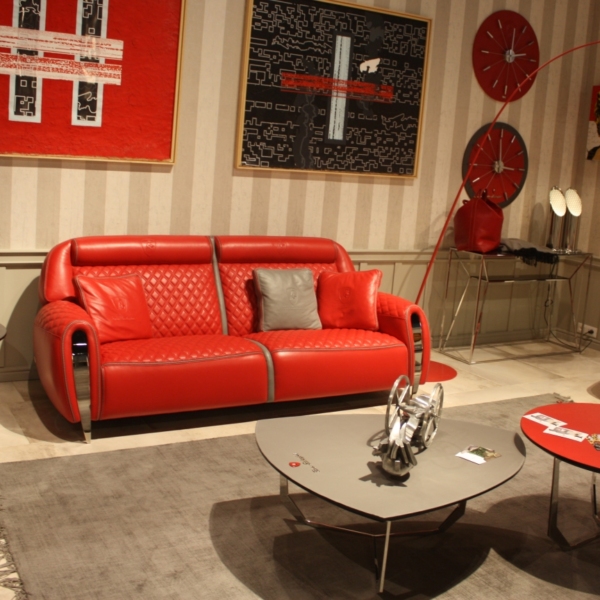
Small spaces present the perfect opportunity for a cozy setup, but these rooms also have drawbacks. Decorating a smaller space can be tricky, especially for those not into excess or maximalist decor.
To help you make the most of your room, we interviewed two designers to get the low-down on small space decor mistakes.
Ignoring Furniture Scale and Proportions

Choosing the right furniture is one of the hardest parts of designing a small space. Large items can make a room look bulky, while pieces that are too small look out of place.
According to New York-based Home Designer Nina Lichtenstein of Nina’s Home Design, it’s important to consider scale and proportion. “Resist the urge to overcrowd the space with too much furniture,” she advises. “Opt for multifunctional pieces and consider the scale of each item to maintain an open and airy feel.”
Failure to Balance Dark Tones
There’s nothing wrong with using dark tones in a small space. Dark colors can create an intimate atmosphere, but the overuse may lead to a cave-like setting. Consider a light color flooring or natural-toned area rug if you’ll use dark colors on the wall.
Also, balance out dark walls with lighter wood furniture. Those with dark floors can consider a light to medium tone on the wall and a balance of colors through furnishings and accessories.
Relying On one Type of Lighting

While overhead lights come in handy, solely relying on them can lead to a harsh feeling room. Seymen Usta, an interior design specialist and founder of Seus Lighting, addresses the importance of natural lighting. “Inadequate lighting can make a small space feel even smaller and less inviting. Maximize natural light by keeping windows unobstructed.”
Those who don’t have an abundance of natural light in their small space aren’t out of luck. According to Seymen, a mixture of other light sources will help. “Use layered lighting (ambient, task, and accent) to create depth and make the space feel larger.”
Going Pattern-Crazy
Adding patterns to a room is an easy way to create visual interest. In small spaces, though, you need to be mindful of how much pattern you add. Competing patterns will make the space feel busy and chaotic. Stick with only one or two patterns. Then, rely on different textures to create visual contrast.
Cluttering the Room with Excess Decor

Our experts agree that cluttering a room with excess decor is a major design mistake in small spaces. Unless you’re going for a maximalist look, use a “less is more” design method for your room.
To avoid making the room feel crowded, Seymen recommends adopting a minimalist approach. “Choose a few key pieces that add character without overwhelming the space. Each item should have a purpose or bring joy.”
Using Heavy Window Treatments

Heavy window treatments can weigh down a small space. Instead of long, floor-length drapes, consider a shade or sheer curtains. If you live in a private location, skip window treatments and let natural light pour through.
Lacking Mirrors In Your Small Space
Mirrors aren’t just for the bathroom — they’re fantastic for making a room look larger and can add elegance or whimsy to your space.
Home Designer Nina Lichtenstein says, “Mirrors are a powerful tool in small space design. Neglecting to incorporate mirrors can miss an opportunity to reflect light, create the illusion of depth, and enhance the overall sense of spaciousness.”
Neglecting Vertical Space

When square footage is an issue, turn to vertical space to compensate for a lack of storage. Hutches, floating shelves, and tall furniture draw the eye upward, making the room look taller. These pieces also offer a place to tuck away keepsakes and supplies.
Tall storage or floating shelves are essential in small offices or craft rooms. Maximizing vertical space is the best solution to organizational problems.
Not Creating a Cohesive Color Scheme
Creating flow is key to a well-put-together room, and you can do so with a curated color scheme. “A disjointed color palette can make a small space feel chaotic,” says Nina. “Stick to a cohesive color scheme to maintain visual continuity and make the space appear more cohesive.”
Option for Visually Heavy Furniture Pieces
Visually heavy items like wooden ceiling planks, clunky nightstands or side tables, and oversized furniture will dwarf your room. Consider replacing heavy pieces with those that create the illusion of airiness. Some options include glass or acrylic furniture and light wood-tone pieces with clean lines.


