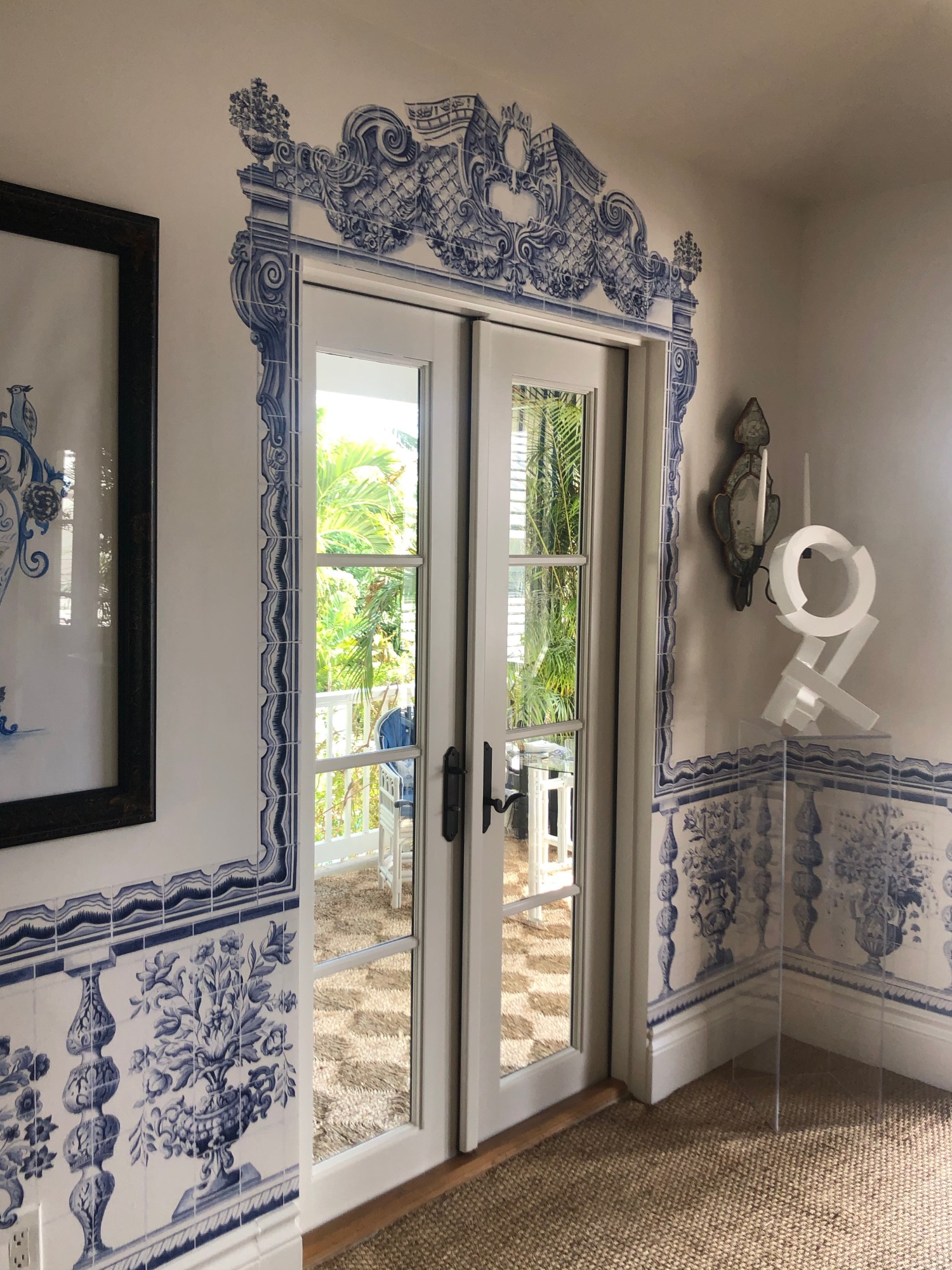
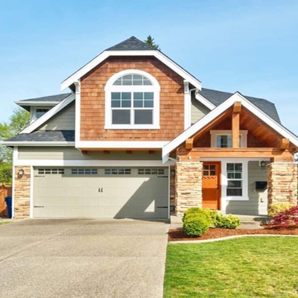
Entryways are often overlooked, but they play a crucial role in your home, and even this part of your home is subject to the fleeting whims of fashion. Outdated entryway trends have become obsolete due to overuse, not poor design. As with any new trend, you have the option of following it or not. Ultimately, entrances should capture the essence of your design while remaining functional. Focus on entryway ideas that accomplish both in order to create the most classic design for your needs.
Outdated Entryway Trends
The entryway is an essential space for showcasing your personal style to guests and improving the usability of your house. Think about some of the ways you can modernize your entry’s style without compromising your personal tastes and requirements.
Only Using Neutral Colors

Neutrals always have a timeless and classic look, but using only neutrals in entryways with no pops of color can make the space appear sterile and lack personality. People today are being bolder and more creative with their color choices, and this is making its way into the entryway.
Even if you prefer neutral-colored walls, you can use color to make your entryway more vibrant. To avoid an entryway that feels bland, designers often advise injecting pops of color into your entry using accessories, artwork, or accent furniture. This not only gives the space more personality and coziness, but it also gives you more freedom to change the color scheme and décor whenever the mood strikes or the seasons change. The harmony between the use of strong colors and neutrals creates a space that is both aesthetically pleasing and welcoming.
Overuse of Bulky Furniture

The preference for large and bulky furniture versus a simple and streamlined style is always shifting. Modern design preferences favor furniture with a slimmer profile than in previous eras. This does not mean that your furniture can’t make a visual impact.
Rather than relying on large furniture to impress your visitors, select pieces that are smaller in size but more interesting in style. This could include a distinctively shaped console table, bench, or set of chairs. Ultimately, the furniture you place in your entryway should be the most usable for your everyday life.
Builder’s Grade Lighting

Standard light fixtures that builders use lack aesthetic appeal and interest because they are frequently chosen based on cost rather than style. What better place to make a personal statement with lighting than the entryway?
The lighting in this area establishes the tone for the rest of your home. The lighting doesn’t need to be overly large or unconventional; rather, it should be appropriately sized for the space and work well with the style of your home.
So, whether you prefer a playfully colored eclectic chandelier, a sophisticated art deco pendant light, or Edwardian wall sconces, the choice is yours. But whatever you choose, don’t let it be generic.
Not Considering Storage

When designing an entryway, it is easy to get caught up in how it looks rather than how it will function. Thankfully, there are ways to incorporate both style and functionality into a space. A built-in cabinet with both open and closed storage is an excellent choice for entryways. In addition to having a classic appearance, these enhance the space’s usability.
The majority of us can never have too much storage, so even if you do not require as much as a built-in cabinet would, make sure to take storage into consideration. Consider getting a console table with roomy drawers for your leash, mail, or keys. Storage benches that open to hold extra blankets, bookbags, shoes, or games are another option.
Overuse of Mirrors

We all enjoy the reflective glow and unique appearance of mirrors in the entryway, which is why they have become such a popular trend. While mirrors still look good and serve a functional purpose in an entryway, you should consider other ways to decorate your entry walls if you want your room to stand out. Rather than hanging a mirror, select a series of vintage prints or a statement piece of wall art. You could also hang a collection of items you own, such as antique serving plates, hats, or woven textiles.
Small Rugs

Rugs are an essential component of entryway design because they help to limit dirt and debris tracked into the home and anchor the space. Many people prefer to have door mats on the exterior and interior near the front door, but these small interior rugs can make the entry appear smaller. Instead, consider using a large rug as a foundation for the other pieces in the entry. Even though it seems counterintuitive, larger rugs actually make your space appear larger. Of course, the rug you select should fit the floor area. Choose a rug that allows at least some of the floor to peek out on all sides.
Clutter

Clutter in our entryways has never been a trend, but it does happen, especially in high-traffic areas. Dropped bags, mail, shoes, and other remnants of hectic family life inevitably make their way into entries. Managing the detritus of our lives in the entry is key to creating a hospitable space.
There are several useful additions to the entryway that help keep the chaos under control. These include hooks and wall shelves, shoe bins, and storage baskets. Keeping the clutter down will also require ongoing maintenance.
Develop a standard routine for cleaning the entry area. Remove items that do not belong there, and donate items that are no longer useful. Consistently evaluate the space to determine which furniture works and which does not, and consider alternative options that may work better.
Overreliance on Mass-Produced Elements

Fast furniture and decor are inexpensive and easily accessible, so it is understandable that many people utilize these options in their entry. Modern trends in all of home design are leaning into ways that you can make your space unique. Fast furniture often features generic characteristics that will not set your space apart from your neighbors. It also uses lower quality materials and trendy shapes that will quickly wear out or look dated.
Instead, choose pieces that are unique. Look for handmade, vintage, and antique items that can add interest to your space. Modernize or refurbish them with a fresh coat of paint, stain, or new upholstery.
Never Changing Layout

Many people design an entry and never change it. This is a missed opportunity to create surprise and dynamism in your home’s style. Most entries are small, so they are excellent spaces for trying out new designs and colors. This does not mean that you need to be constantly buying new furniture. Rearrange the pieces you have or bring in new wall art from another area of the home. There are countless ways to reimagine your space if you have the will and energy to try.
Overuse of Small Decor

Most people will only be in your entry for a short period of time, so there is not much time to leave an impression. While the size of the elements in your entry should vary, limit the number of small items. Elements such as candles and small photo frames will not be noticed by the majority of people and will only add to the appearance of clutter, requiring maintenance to keep clean and tidy.
To fill the space on an entry console table, choose larger decor items such as a medium to large vase, bowl, houseplant, sculpture, or a set of large books. These items may be personal, but they still create a curated look. If you have small items that you need in your entryway, place them on a tray for a more organized look.


